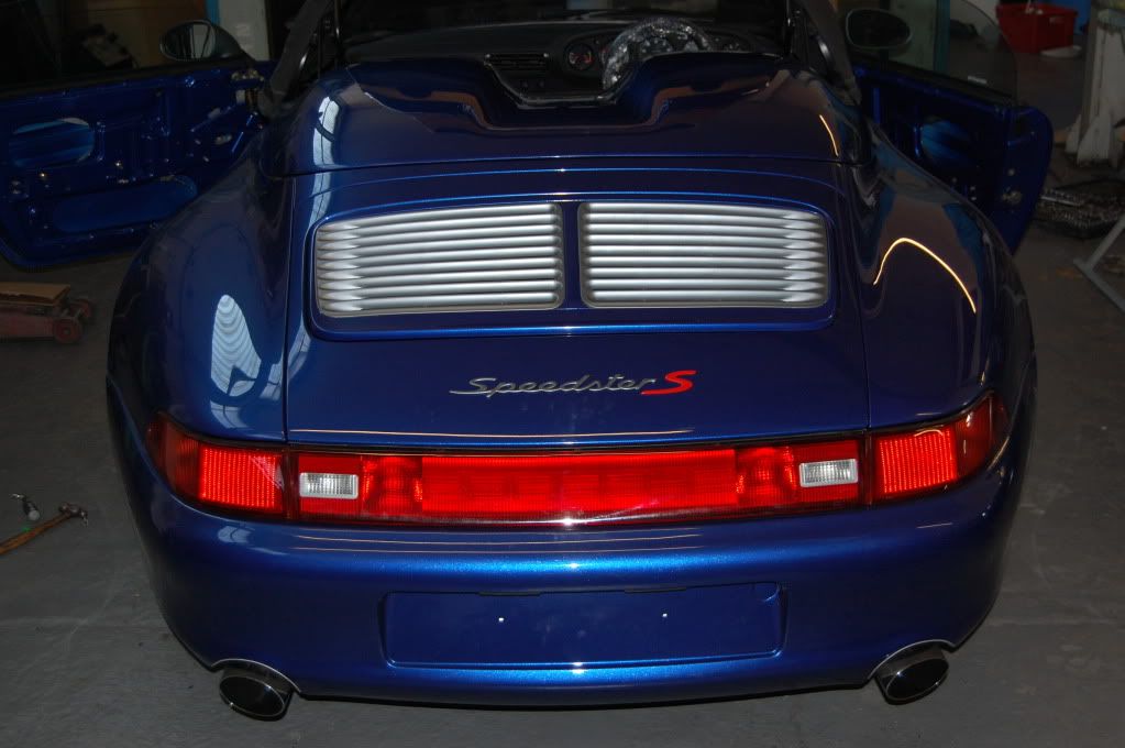
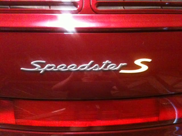
9m93 Speedster S #3 - Prime Time viewing.
#452
 [/URL]
#454
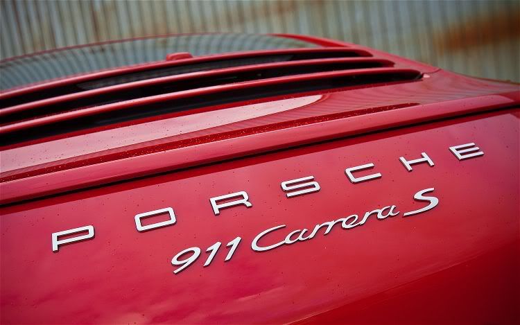
It's details, but I do not completely agree. If you compare your S-placement to the an S-tach or factory installed 'Carrera S' script you will see there is a nice bit of margin below the a in Carrera script, but in your case the S would almost touch the a (in Carrera) and there for it should (in my opinion) be lowered vertically (so the S is vert-aligned with the small letters in Speedsters as it is correct to do in good typography) and placed slightly closer to 'r' similar to the distance of 'a' and S in the Carrera S script ... more or less like this:
 [/URL]
 [/URL]
if you look at the last letters "a" at carrera and "r" at speedster you can see a big difference: the right edge of the badge at "a" is at the bottom, which fits perfectly in the curve of the "S". However at "r" the edge is at the top and it would touch the "S".
best would be, if i could position the "S" like the "carrera S" badge, so i have already asked Marc to remove them and we will re-position them together on Monday. I have to see it in real to make the final decission.
I would be happy if i could have the same look like on carpet embroidery but i'm afraid i have to create my own "S" badge to have this look. (The S should be about 10-15% bigger than the factory to have enough space for the "r")
In "worst case" i would like to have the look of my rev counter decal.
#455
Hi RP
I agree. That is why my suggestion was a compromize which consisted of aligning the S vertically (measured from the small letters in Speedster, which is what Porsche did with the original Carrera script) and achieving a similiar distance from the 'r' (Speedster) to the S, as in the a (Carrera) to the S. I think thats as close as you're going to get to factory look without modifying the S as shown in the embroidery on the mat. But please don't do that - looks a bit out of balance, and the S-shape looses some of it's dynamics in my opinion.
I agree. That is why my suggestion was a compromize which consisted of aligning the S vertically (measured from the small letters in Speedster, which is what Porsche did with the original Carrera script) and achieving a similiar distance from the 'r' (Speedster) to the S, as in the a (Carrera) to the S. I think thats as close as you're going to get to factory look without modifying the S as shown in the embroidery on the mat. But please don't do that - looks a bit out of balance, and the S-shape looses some of it's dynamics in my opinion.
#456
Thread Starter
Addict
Rennlist
Site Sponsor
Rennlist
Site Sponsor
Joined: Oct 2002
Posts: 4,447
Likes: 195
From: Cheshire, England
OK, OK, I get the message. Good grief!
Now, would all you opinionated onlookers who have nothing better to do than measure badges now care to come down here and tell Marc to move the badge?
I mean, it's not like he hasn't got enough on his plate repairing the erratic central locking module, rewiring the Hifi, fixing the door window (for the second time), getting the car MOT'd, taking the car for a dyno remap, fixing the rattle from the rear view mirror.......
Your call RP, should he finish the car or move the badge?

#457
Nordschleife Master
Joined: Dec 2008
Posts: 5,474
Likes: 32
From: In front of you and to the left ...
Theoretically i agree with you, but there is a small "problem":
if you look at the last letters "a" at carrera and "r" at speedster you can see a big difference: the right edge of the badge at "a" is at the bottom, which fits perfectly in the curve of the "S". However at "r" the edge is at the top and it would touch the "S".
if you look at the last letters "a" at carrera and "r" at speedster you can see a big difference: the right edge of the badge at "a" is at the bottom, which fits perfectly in the curve of the "S". However at "r" the edge is at the top and it would touch the "S".
#458
So the factory made two versions of this car, the Speedster and the Speedster S ?
Or is this turning into one of those special Rennlist short-bus threads about badges and sunshades and what color Porsche crest should be on your valve stem caps and how to prevent rust on your rotors when you wash your car?
Or is this turning into one of those special Rennlist short-bus threads about badges and sunshades and what color Porsche crest should be on your valve stem caps and how to prevent rust on your rotors when you wash your car?
#459
Nordschleife Master
Joined: Dec 2008
Posts: 5,474
Likes: 32
From: In front of you and to the left ...
#460
I didn't mean to start a sunshade-type discussion at all, but just wanted to point out the methodically (german) correct way

#461
Nordschleife Master
Joined: Dec 2008
Posts: 5,474
Likes: 32
From: In front of you and to the left ...
I just wanted to point out the factory (being germans and all) had a method to the placement based on basic principles of typography by going with vertical alignment. The rest is just basic kerning - should be the same regardless if the word ends on r or a - thats actually the fine art of producing a professional typeface to make sure it kerns correctly no matter what two letters are combined.
I didn't mean to start a sunshade-type discussion at all, but just wanted to point out the methodically (german) correct way
I didn't mean to start a sunshade-type discussion at all, but just wanted to point out the methodically (german) correct way

#462
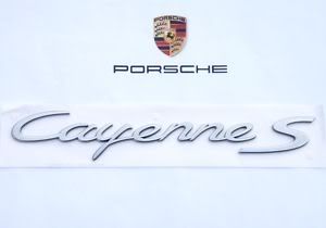
Cayenne S is 100% vert-aligned too.
The S in 4S is also a methodical placement, but this time vert-aligned around the '4' (theres an equal amount of S-swoosh above and below the '4'). Not how I would do it, but it seems they 'fixed' this on the 997 which is vert aligned around the Carrera script.
#463
Nordschleife Master
Joined: Dec 2008
Posts: 5,474
Likes: 32
From: In front of you and to the left ...
We're way O.T. here .. sorry Colin .. I think Porsche design teams place the badge on a case by case basis:
Cayenne. distance and alignment don't look the same:
'09 Carrera S factory badge (Road and Track):
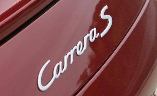
'11 Carrera S:

Cayenne. distance and alignment don't look the same:

'09 Carrera S factory badge (Road and Track):

'11 Carrera S:
