


Apple Car Play
Thread Starter
Advanced

Joined: Jun 2003
Posts: 82
Likes: 2
Race Director
Joined: Nov 2009
Posts: 10,594
Likes: 8
From: THE Republic
the icons are a function of the screen size.
Porsche is currently not expected to offer this as its wants to maintain its profit margins w/ their Proprietary Software- the horrid PCM.
Google, platform will be coming shortly.
Porsche is currently not expected to offer this as its wants to maintain its profit margins w/ their Proprietary Software- the horrid PCM.
Google, platform will be coming shortly.
Instructor

Joined: Jun 2007
Posts: 157
Likes: 6
From: Monterrey
They are late but I will welcome them as soon as they get here!

Instructor

Joined: Nov 2012
Posts: 178
Likes: 12
Yep, it's ridiculous for a car maker to think that they have the ability to keep up with mobile computing (both hardware and software). This sort of interface could solve a fair number of issues with obsolescence, particularly if it were an open industry standard that could be coded for by any company in the future.
In the meantime, no way in hell am I buying a new car to get this, but it's certainly annoying having PCM bugs and worse maps when this should have been doable for years already. :/
In the meantime, no way in hell am I buying a new car to get this, but it's certainly annoying having PCM bugs and worse maps when this should have been doable for years already. :/
Trending Topics

Advanced
Joined: Dec 2013
Posts: 85
Likes: 23
I think in this case the size is appropriate. If you need to access these functions while driving, you want an easy to hit target to tap, without having to worry about hitting the wrong thing. So, ergonomically, making them small, while it might look prettier, would be a mistake. Also consider that it's an arms-length interface, so they need to be big enough to see clearly.
Last edited by apias; Mar 5, 2014 at 01:41 PM.
Rennlist Stories
The Best Porsche Posts for Porsche Enthusiasts
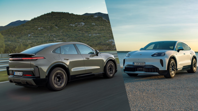
Porsche Reveals Coupe Variant of the Electric Cayenne With a Fresh Look
Verdad Gallardo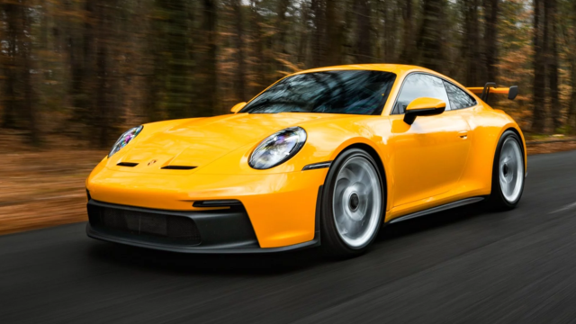
10 Porsche Colors That Have More Personality Than Most People
Verdad Gallardo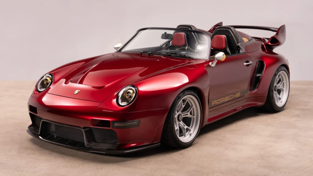
Guntherwerks' Final Speedster Creation Is the Ultimate Porsche Restomod
Verdad Gallardo
10 Reasons I Hate Going to the Porsche Dealership (& the 1 Reason I Stay)
Joe Kucinski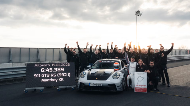
Porsche Shakes Up The N�rburgring Lap Record Table Once Again
Verdad Gallardo
6 Ways the Porsche 911 GT3 S/C Redefines Performance
Joe Kucinski
10 Wildest Homologation Specials Porsche Ever Sold
Verdad Gallardo
Super Rare RUF BTR III Comes Out of Hibernation, Looking For a New Home
Verdad Gallardo
10 Porsche Opinions That Can Start a Fight
Joe KucinskiRennlist Member
Joined: Apr 2012
Posts: 102
Likes: 1
From: Atlanta
I think in this case the size is appropriate. If you need to access these functions while driving, you want an easy to hit target to tap, without having to worry about hitting the wrong thing. So, ergonomically, making them small, while it might look prettier, would be a mistake. Also consider that it's an arms-length interface, so they need to be big enough to see clearly.
Now from a hardware AND software standpoint, I test new Google products every 6 months... and keep coming back to Apple. I guess I'd take the big colorful icons vs a Google based system on the PCM.
Advanced
Joined: Dec 2013
Posts: 85
Likes: 23
The size isn't really what bothers me but rather the colorful icons that make it look cheap (though it does not on an iPhone). I'd be fine if they used the same color scheme as on the PCM for instance (white on black with only a touch of color when needed), but I guess that Apple wants to make the interface clearly identifiable and consistent with their other products.
Now from a hardware AND software standpoint, I test new Google products every 6 months... and keep coming back to Apple. I guess I'd take the big colorful icons vs a Google based system on the PCM.
Now from a hardware AND software standpoint, I test new Google products every 6 months... and keep coming back to Apple. I guess I'd take the big colorful icons vs a Google based system on the PCM.