When you click on links to various merchants on this site and make a purchase, this can result in this site earning a commission. Affiliate programs and affiliations include, but are not limited to, the eBay Partner Network.
This stuff worked awesome. Spray and leave for a few minutes. Heat with hair dryer and I used a $.57 plastic scrapper. Lettering came right off. Soaked again with spray and the remaining sludge came off pretty easy with a washcloth.
Used Turtle Wax scratch remover for some very minor scratches, then wax - done.
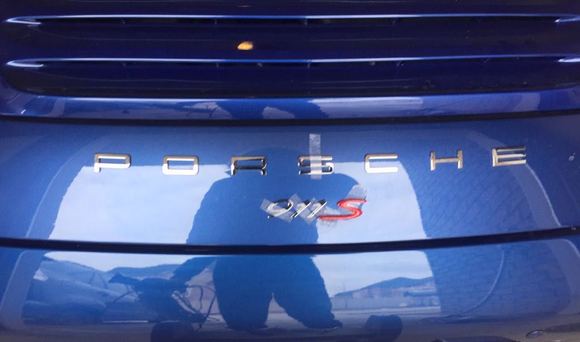
Dealer wanted ~300 for the new lettering[labor only]... I'm ~10 bucks and 15 minutes in to remove. Hoping this makes for cheap labor to re install the "911" with template.
some guidelines for an oem '911' badging job
============================
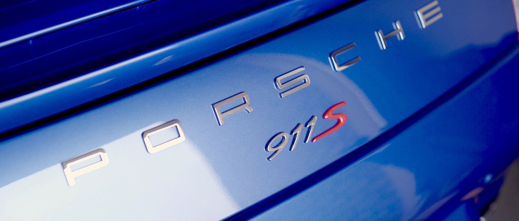
- the height of oem 991 sized badging is 7/8" high (if you mask it at that height with painters tape it'll guarantee you get the proper oem 911 'slant' properly.
- the 911 itself 2+3/4" inches wide (make the markings on the painters tape to make sure you 'lock' the overall width)
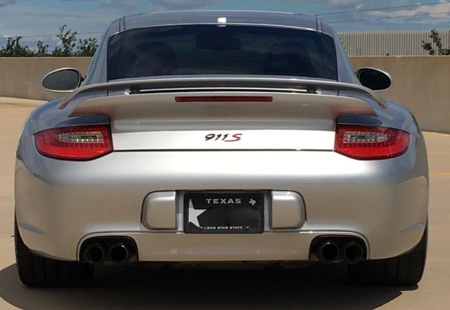
- before measuring and applying painters tape and or removing the 911 adhesive from the back, ALWAYS do a quick test fit and just stick the 911 logo on the back of your car with clear tape. stand back from afar (a car length or two) and see if the overall height of the badging feels natural/oem. this way you may realize that your badging is too low/too high and you can mark the exact height you feel looks oem/the best. use the details in the taillights as a guide to measure height, and be sure to compare carefully with photos of other 991's with the badging that you want to emulate (ideally cars that have had the dealer apply the badging, so you're following an oem example)
- try your best to ensure the gap spacing between 9+1, and 1+1 is pretty much the same.
- before removing the rear adhesive and after most of the measurements + painters tape has been applied, do a test fit as best you can with the clear tape to hold the badging in place. add whatever markings to the painters tape so you know the final placements of the letters.
ignore my 'PORSCHE' badging below as well as my Red S, but the '911' approach is the same.
i put an album up help other 997 owners apply badging, a lot of the theory is the same regardless of which 911. all my oem measurements were taken off a friends 991. https://rennlist.com/g/album/3372540
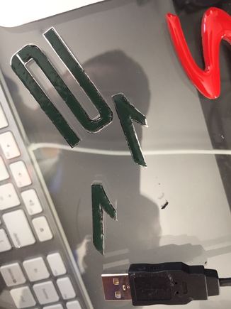
below are some photos to help illustrate what i mean via painters tape to lock the height, marking the tape to lock the correct width,exact same spacing between the numbers, using clear tape for 'test fits' + the final product itself
Great info myw. I wish I'd have known this a few weeks ago. I just did the best I could eyeballing it.
you are very welcome!
you can always redo it you want, just have to apply new adhesive to the back and cut with an exacto knife... i had to redo the 911 (shift it all to the left) when i added the red S.
I currently have '911' in chrome but want to change to flat black. Does anyone know the OEM part number for the black 911 emblem? I know Suncoast sells them but they don't list the part number.
I currently have '911' in chrome but want to change to flat black. Does anyone know the OEM part number for the black 911 emblem? I know Suncoast sells them but they don't list the part number.
This appears to be it, but please verify for yourself: 991.559.231.04. $43.xx seems to be about as cheap as it gets.
Also FYI, when I did this on my last 911, the letters came attached on the strip in the correct orientation and spacing. Although you do have to remove them from the strip to stick them on, I first taped the whole set down still on the strip with the excess cut away from the edges, outlined the area with masking tape, and carefully marked where the edges of the letters belonged on the masking tape before pulling them off the strip. Effectively I was able to get them back on exactly as they were on the strip.
Thanks. I just might do it again because the 9 looks a tad high.
BTW, comparing your photo to the one in my last post and the others just above it, I'd say the 9 isn't really too high... instead it is rotated slightly counterclockwise and thereby making it a little taller than the other letters.
Thanks. I just might do it again because the 9 looks a tad high.
Originally Posted by StormRune
BTW, comparing your photo to the one in my last post and the others just above it, I'd say the 9 isn't really too high... instead it is rotated slightly counterclockwise and thereby making it a little taller than the other letters.
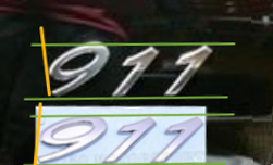
myw has provided excellent guidance in his posts just above and I certainly can't do better than that, but I did do a little comparison test for you (I'm stuck at home sick and a little bored... then I saw another post you made and thought of doing this!).
Comparing your letter placement to ones still on the sheet in the factory orientation (which agrees with the images myw shows), you can see there are small orientation and spacing differences in general. However, you can especially see your 9 is rotated counterclockwise causing it to be taller.
The orange lines I've photoshopped on the image are aligned with the front edge of the 9s in both cases making the rotation difference very evident. Also as myw pointed out the spacing between letters is a little larger.
Again, you really did do a great job free-handing it and most people will never notice anything unusual. It's certainly up to you as to whether you decide to change it or not.
One way to tackle that too is to use an exacting knife to cut out where the numbers are and use that as a template. Simply stack painters tape to get level and just work on centering.

 03-29-2017, 02:58 PM