When you click on links to various merchants on this site and make a purchase, this can result in this site earning a commission. Affiliate programs and affiliations include, but are not limited to, the eBay Partner Network.
Unfortunately, the pre-update "form" just looked too dated and was a real competitive disadvantage for cross-shoppers. Most buyers aren't tuned into the functional downsides of the new interior and just see an interior that looks ~10 years too old on a new Porsche in the showroom.
I also think the pre-update had *too* many buttons from a functional perspective. Ultimately I think there was better middle-ground between the 2 interiors. But I'd still personally choose the new interior for the more upscale look.
Really, the Macan just deserves a full new ICE gen vs 2nd refresh. There is sufficient demand over the next decade for the business case. I think it'd be a better allocation of resources than the updated Panamera coming out soon.
Yes but my detailer said you can order the individual pieces, I didn't want all those extra strips, just did the center console, the strip where the other haptic buttons are with the radio ****, and the touchscreen.
I don't hate it, but it's clearly not an improvement. Feels like everyone is out there trying to copy Tesla's UI design, but personally I think Tesla interiors are terrible and I would never buy one.
Needing to take your eyes off the road to make a minor change feels like a poor design choice, especially for such a driver-oriented brand. But this also reminds me of the recent craze to redesign gear selectors. I've seen terrible designs from Fords to BMWs and even to Porsches. If it's not broken why fix it? I think the 2020 Macan's gear selector is perfect. The one on the new 911 feels like change for the sake of change, not a real improvement in any meaningful way.
Agree with everyone re: touchscreen/haptic feedback controls. I remember Audi went this route with the double screens, 2nd screen to control climate, etc. All their new models now, E-Tron GT etc, have all gone back to actual buttons. Hopefully Porsche follows w. their upcoming EV's. From the leaked photos it does look like Porsche will not be copying the Taycan 2nd screen.
IThe one on the new 911 feels like change for the sake of change, not a real improvement in any meaningful way.
What, you don't like the electric razor shifter nub...how is that possible LOL.
Your missing the symetry of how that the electric razor nub ties into the newer front end design of the whole lineup where all the grills and trim are blacked out and look like the foil of King Kong's electric razor. Anyone who thinks this was an aesthetic improvement has suspect taste and it was purely driven by Porsche's desire to be able to use the same front piece on every color of car offered instead of having to color match them, making more.profit. The first thing I'd do if buying a newer Porsche would be to add the body color accents back into the louver pieces of the front end either by paint matching or vinyl wrapping.
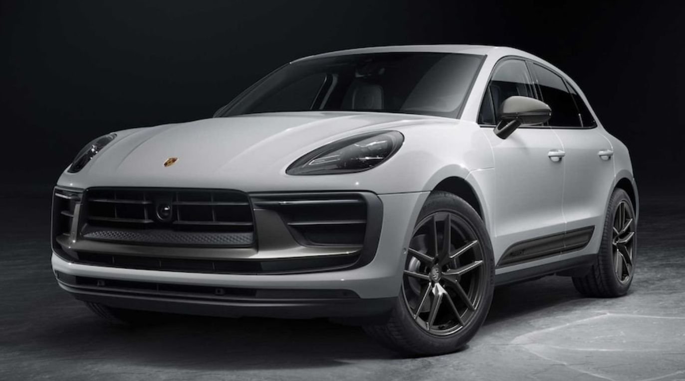
I can't imagine anyone thinks this unfinished front grill treatment
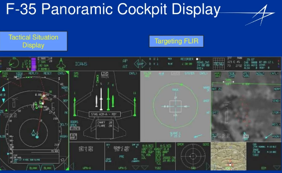
I did a quick Google of "F16 / F18 cockpit layout" and there are lots of physical switches, toggles and buttons there. No haptic feedback or smudged touch screens when you're going Mach 2! Don't want to spend even a second longer than necessary looking down to make sure you hit the right patch of haptic feedback sensors on a black panel.
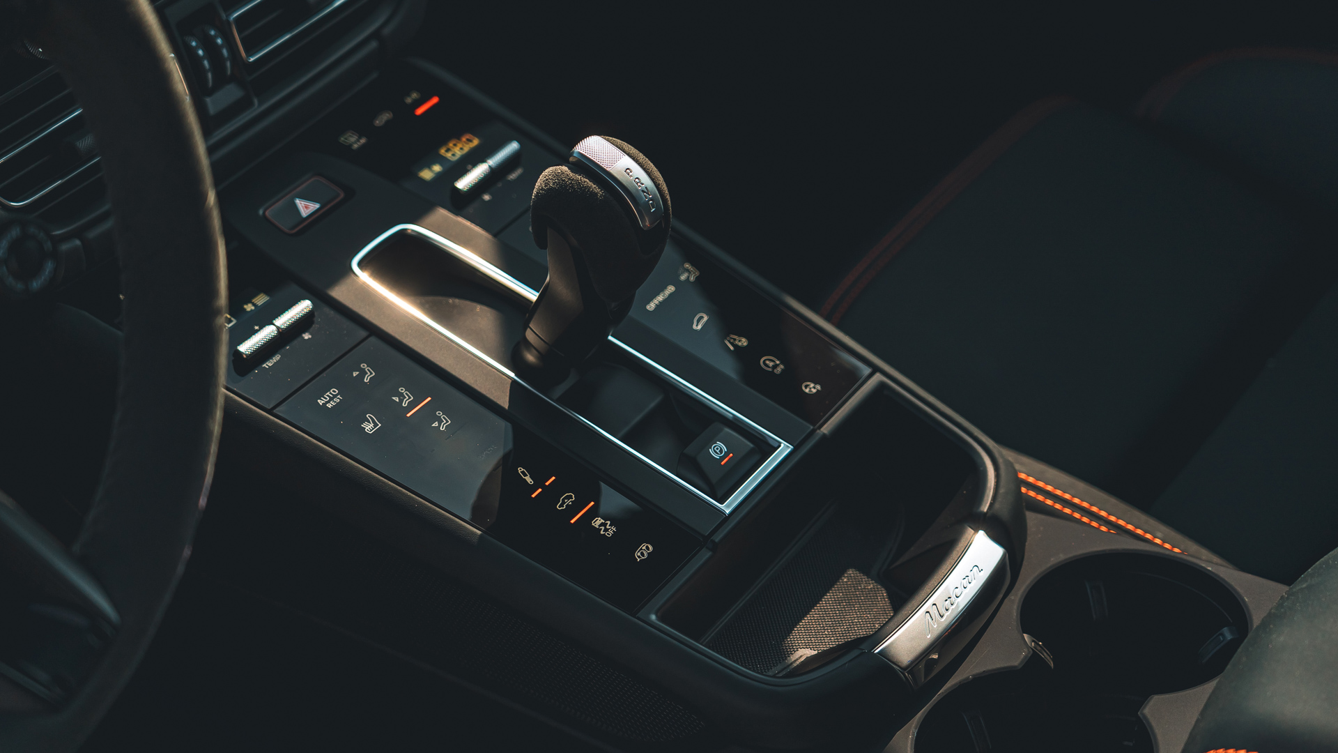
I always thought the rows of buttons on either side of the Macan shifter and the ones overhead were an attractive layout that reminded me of a cockpit. Why change it other than to copy Tesla?
Again, none of this will keep me from buying another Macan, but it definitely doesn't feel like an upgrade.
I always thought the rows of buttons on either side of the Macan shifter and the ones overhead were an attractive layout that reminded me of a cockpit. Why change it other than to copy Tesla?
Again, none of this will keep me from buying another Macan, but it definitely doesn't feel like an upgrade.
When the "multi" button layout debuted back in 2010 in Panamera - Walter Rohr introduced it as "Porsche - one button - one function" - as a practical function over form set up that Porsche thought was better - More options you got, the more button you go to push. I like the old set up - but have no issue with the new one, except the constant finger prints on the black looking bad - so I carry a micro fibre cloth in the center console to wipe it down regularly.
What, you don't like the electric razor shifter nub...how is that possible LOL.
Your missing the symetry of how that the electric razor nub ties into the newer front end design of the whole lineup where all the grills and trim are blacked out and look like the foil of King Kong's electric razor. Anyone who thinks this was an aesthetic improvement has suspect taste and it was purely driven by Porsche's desire to be able to use the same front piece on every color of car offered instead of having to color match them, making more.profit. The first thing I'd do if buying a newer Porsche would be to add the body color accents back into the louver pieces of the front end either by paint matching or vinyl wrapping.
I can't imagine anyone thinks this unfinished front grill treatment
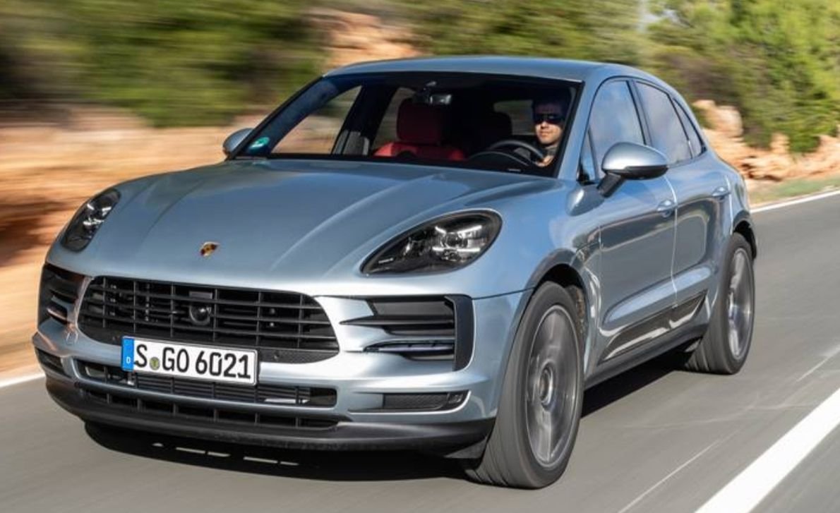
Looks better than this one
The New Macan Base and S have more body colored parts in the front grill which does look better than the T or GTS grill.
I did a quick Google of "F16 / F18 cockpit layout" and there are lots of physical switches, toggles and buttons there. No haptic feedback or smudged touch screens when you're going Mach 2! Don't want to spend even a second longer than necessary looking down to make sure you hit the right patch of haptic feedback sensors on a black panel.
I always thought the rows of buttons on either side of the Macan shifter and the ones overhead were an attractive layout that reminded me of a cockpit. Why change it other than to copy Tesla?
Again, none of this will keep me from buying another Macan, but it definitely doesn't feel like an upgrade.
The controls on the smooth center console are infrequently used and not applicable to the discussion.
The most important control is the hazard switch, is still a mechanical button and remains at top center. Lesser for temp / fan up/down, also remaining as mechanical.
The smooth switches will need several glances to safely actuate while driving.
The linked article has valid points. The controls on the smooth center console are infrequently used
Maybe by you, but I use mine a lot while driving, often in contexts where I'd rather keep my eyes on the road. PSE off/on while entering/exiting my neighborhood, seat heating on because the setting isn't preserved across drive cycles, seat ventilation ditto, PASM when approaching/departing speed bumps in parking lots, recirc when driving alongside diesel trucks.
The most important control is the hazard switch, is still a mechanical button and remains at top center.
Yep, that's a legal requirement. Funny, I wonder if they had a reason for requiring that.
 08-09-2022, 07:22 AM