

Tutorial: Rebadging a 997 Carrera 4S with 991 "PORSCHE" Letter Emblems
 12-04-2016, 05:47 PM
#1
Advanced
Thread Starter
The Introduction
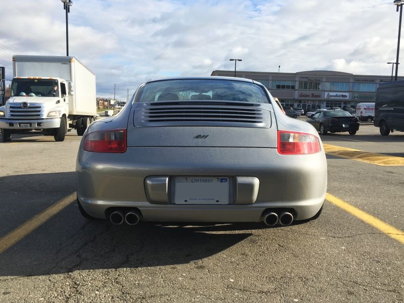
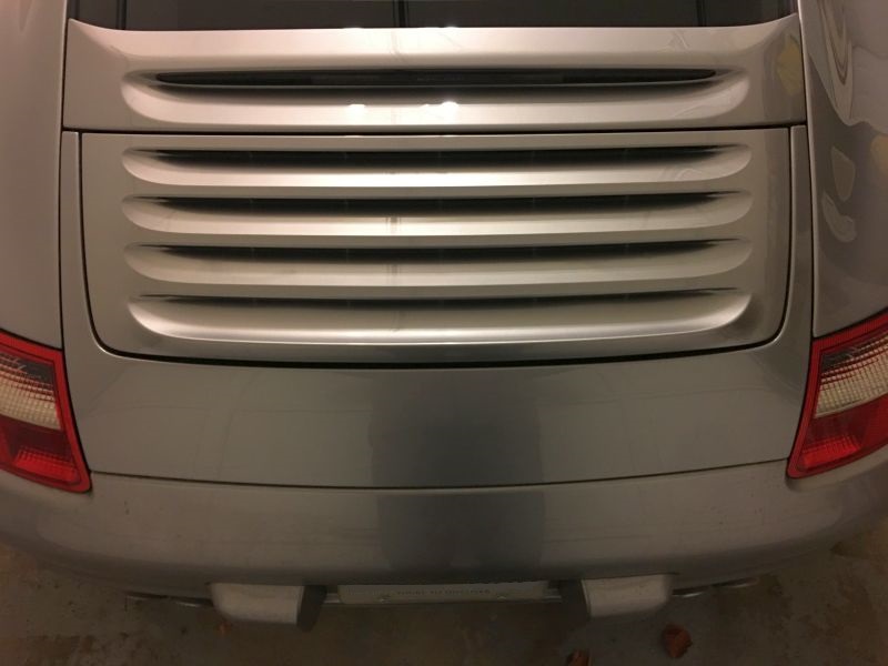
Hi everyone, relatively new P-car owner here, hailing from Toronto.
I picked up my 997 4S about a month ago. The simple "911" badge that it came with didn't really speak to me, so I decided to replace it with the more modern "P O R S C H E" emblem. Flat black on GT silver seemed the right way to go. Please excuse the dirtyness as the car had been sitting around at airport parking for several days.
The Vision
I know there are several sets of Porsche letter emblems on Ebay, but those are all fake / non-OEM. The "E" on those sets are rounded to avoid copyright infringement lawsuits from Porsche. I decided to go for factory originals.
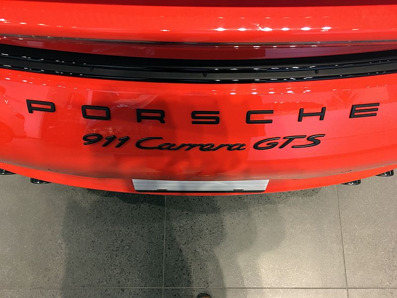
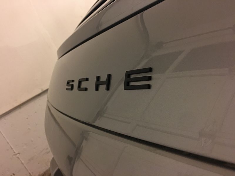
When picking up my emblem from the dealership, I took a few pictures of a current-generation 991 in the showroom.
Notice that the letters follow the curvature of the engine cover. I want mine to look exactly like this.
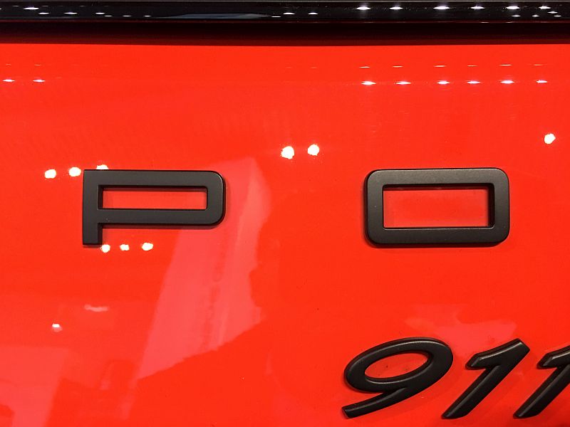
Letter spacing is approximately one letter apart. However, the 997 is narrower than the 991, so there is discretion to reduce the space by a little.
The Preparation
There are plenty of tutorials about how to debadge your car, so I won't go into detail on the preparatory steps. I used floss, WD-40, Meguiars X-scratch, and elbow grease to clean up the engine cover.
Notice that the engine cover and bumper for two curves. You cannot place the letters using straight-rule tape or an envelope for alignment, because you don't respect the engine cover's curvature that way. So, the two parallel red line shown here are a big no-no:
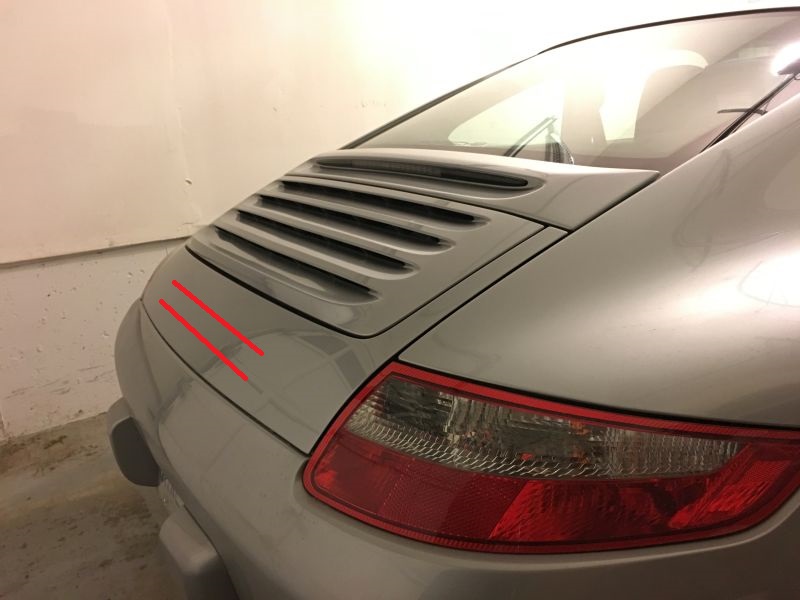
In the next section on theory, I'll explain why, and how to do it properly.
The Theory
We Engineers are an OCD bunch. As a career Management Consultant also, I guess I can only be described as having severe OCD. So, please let me spend time digging into some theory...
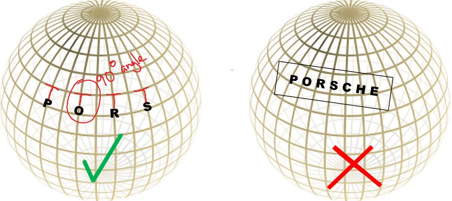
To respect the curvature of the engine cover, you simply cannot use straight-rule tools to align the letters. The letters will appear distorted and curve awkwardly away from the engine cover.
The proper way to do it is to ensure that the letters are 90-degrees to the bottom curve of the engine cover, where it forms a line with the rear bumper.
Here's a diagram to better explain what I mean...
So, what I need is a tool that will allow me to respect the curvature of the engine cover.
The Tool
Being an engineer, I'm also cheap ( engineering lingo is "resourceful" ). Once I figured out the theory, I need a tool that will allow me to consistently and systematically place the PORSCHE letters at 90-degrees to the bottom lip of the engine cover. A straight-rule will not suffice.
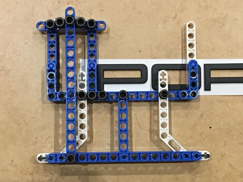
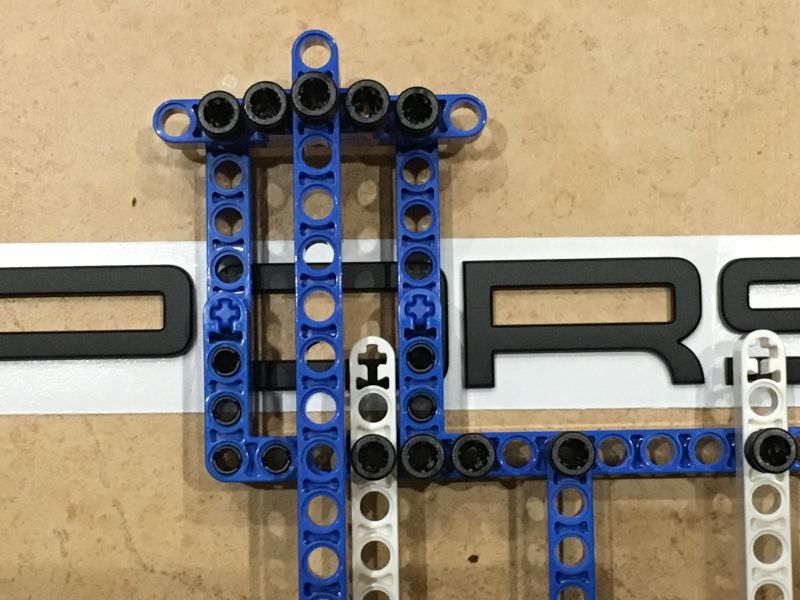
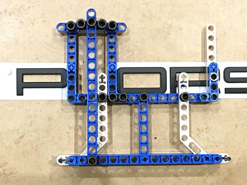
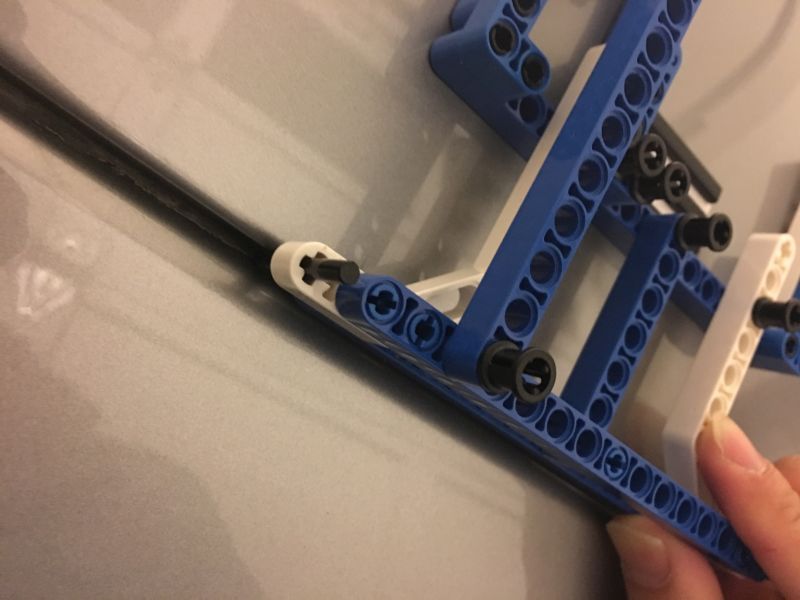
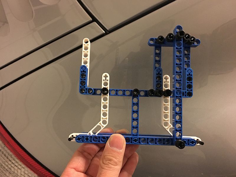
Digging through my kids' toys, I figured I could use some right-angle Lego Technic pieces to build myself a jig. The beauty of this solution is that it's completely customizable, and utilizing the right-angle pieces makes for a pretty rigid jig. I wanted a setting such that the letters aligned to the bottom of the clear part of the rear taillights, so I came up with this:
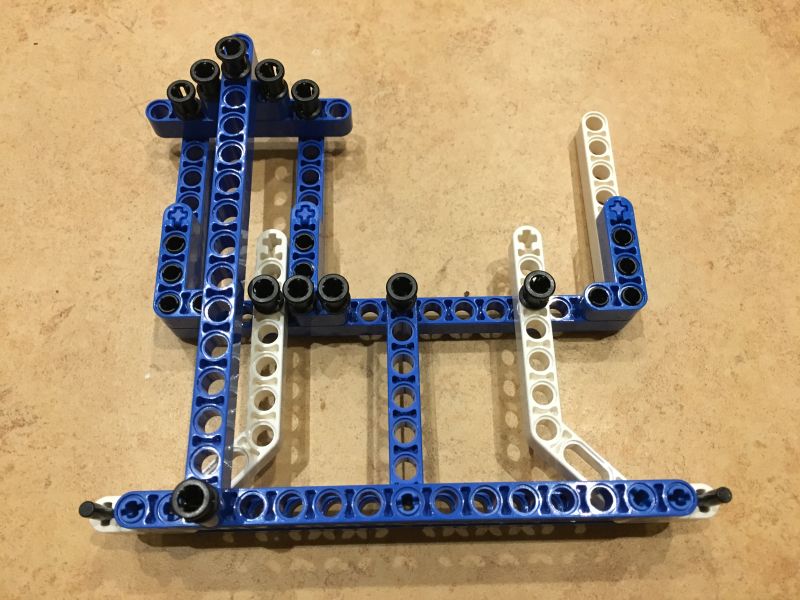
The beauty of this thing is that I could take it apart and rebuild it, if it didn't do its job properly. Gotta love Lego!
The Testing
Ok, so here's where we put theory into practice -- the test placement.
As you can see in this next photo, the letters have a thickness to them, and being perfectly formed, they simply fall into the 90-degree jig with no wiggle room whatsoever. Here, I test fit the "P":
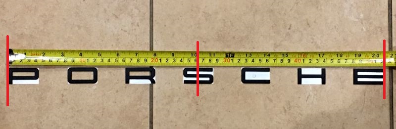
I then proceed to measure the width of each letter in Lego units to properly "space" the letters. As you can see, that works out to be 5 Lego units, which is a hair under the width of the O. This step is not all that important, as you will see shortly that OEM letters all have different widths! This step is really here to allow me to pick a spacing that I like, one that provides both the proper "look" and the proper "width" to accentuate the 4S' fat ***.
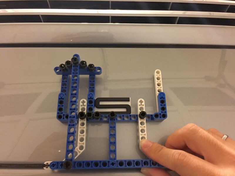
I cut out all seven letters and trimmed the excess backing sheet from each letter. Notice that I built the jig such that it helps me to align the next letter as well, as shown here:
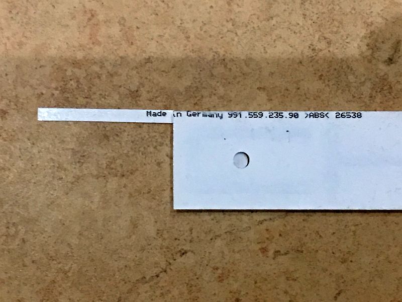
The Letters
Interestingly, the OEM PORSCHE emblem letters are not all the same width. That has two implications:
1. Fake emblem letters have always looked a little "off" to me, and this could be why because the fontface dictates different letter widths!
2. One cannot simply align the "S" (the middle letter) to the midpoint of the engine cover, we have to be a little more creative here.
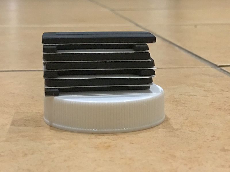
The picture show the different letter widths, stacked from "P" (bottom) to "E" (top):
Therefore, what one needs to do is calculate the total width of the letters, determine the midpoint, and only then align the midpoint of the engine cover to the midpoint of the total length of the "PORSCHE" letters.
What this means, in my case, is that the letters are spaced such that 40% of the "S" needs to lie to the left of the midpoint of the engine cover; 60% to the right.
A picture is worth a thousand words:
The Real Deal
So here comes the real deal -- putting the letters on the car.
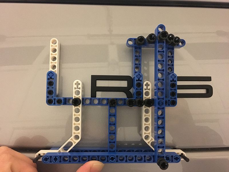
First, I test fit the jig again:
Next, I measure and align the "S" such that 40% of the letter lie to the left of the midpoint of the engine cover. Peeling off the backing paper, the letter simply "drops" onto the jig and it's perfect aligned at 90-degrees to the bottom lip.
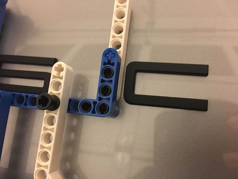
Here's the money shot! After placing the "C", notice that the jig and the vertical portion of "C" are not parallel. This is EXACTLY the effect I wanted, as it meant that the jig, and subsequently the letters, properly respected the curvature of the engine cover.
Onwards to "H" and "E". The curvature is really noticeable now.
Now comes the fun part. I built the jig such that it aligned and spaced letters to the right of the "S" only. When it came time for the letters to the left of the "S", all I had to do was take apart the jig and re-assemble it to "mirror" the previous one. Gotta love Lego!
Onwards to "P", "O", and "R":
The End Result
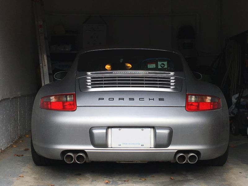
The PORSCHE letter emblems are properly spaced across the engine cover! Notice that the curvature of the letter emblems follow not only the bottom lip's curve, but the "bulge" of the engine cover as well. It is, after all, a 3D surface!
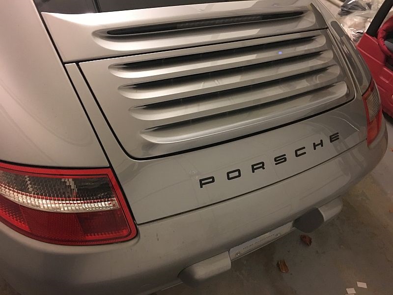
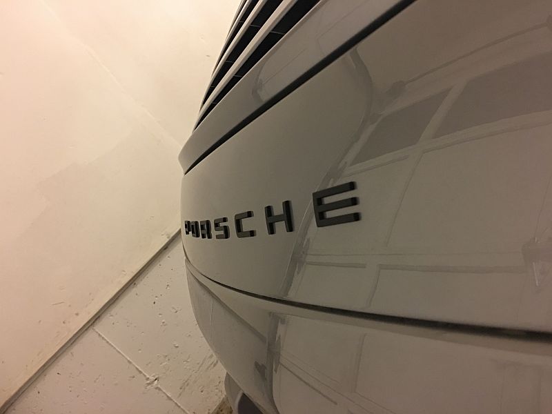
In daylight, and from this angle, the letters correctly form a parallel with the bottom lip, accentuating that beautiful, glorious fat *** that is the 4S. Now this car feels like it's mine!
Hope you enjoyed this tutorial!
Final note: It is aesthetically more pleasing to align the letters to the bottom lip than the top lip formed by the retractable spoiler. The top lip will appear "convex" to the bottom lip in most viewing angles.
Hi everyone, relatively new P-car owner here, hailing from Toronto.
I picked up my 997 4S about a month ago. The simple "911" badge that it came with didn't really speak to me, so I decided to replace it with the more modern "P O R S C H E" emblem. Flat black on GT silver seemed the right way to go. Please excuse the dirtyness as the car had been sitting around at airport parking for several days.
The Vision
I know there are several sets of Porsche letter emblems on Ebay, but those are all fake / non-OEM. The "E" on those sets are rounded to avoid copyright infringement lawsuits from Porsche. I decided to go for factory originals.
When picking up my emblem from the dealership, I took a few pictures of a current-generation 991 in the showroom.
Notice that the letters follow the curvature of the engine cover. I want mine to look exactly like this.
Letter spacing is approximately one letter apart. However, the 997 is narrower than the 991, so there is discretion to reduce the space by a little.
The Preparation
There are plenty of tutorials about how to debadge your car, so I won't go into detail on the preparatory steps. I used floss, WD-40, Meguiars X-scratch, and elbow grease to clean up the engine cover.
Notice that the engine cover and bumper for two curves. You cannot place the letters using straight-rule tape or an envelope for alignment, because you don't respect the engine cover's curvature that way. So, the two parallel red line shown here are a big no-no:
In the next section on theory, I'll explain why, and how to do it properly.
The Theory
We Engineers are an OCD bunch. As a career Management Consultant also, I guess I can only be described as having severe OCD. So, please let me spend time digging into some theory...
To respect the curvature of the engine cover, you simply cannot use straight-rule tools to align the letters. The letters will appear distorted and curve awkwardly away from the engine cover.
The proper way to do it is to ensure that the letters are 90-degrees to the bottom curve of the engine cover, where it forms a line with the rear bumper.
Here's a diagram to better explain what I mean...
So, what I need is a tool that will allow me to respect the curvature of the engine cover.
The Tool
Being an engineer, I'm also cheap ( engineering lingo is "resourceful"
). Once I figured out the theory, I need a tool that will allow me to consistently and systematically place the PORSCHE letters at 90-degrees to the bottom lip of the engine cover. A straight-rule will not suffice.Digging through my kids' toys, I figured I could use some right-angle Lego Technic pieces to build myself a jig. The beauty of this solution is that it's completely customizable, and utilizing the right-angle pieces makes for a pretty rigid jig. I wanted a setting such that the letters aligned to the bottom of the clear part of the rear taillights, so I came up with this:
The beauty of this thing is that I could take it apart and rebuild it, if it didn't do its job properly. Gotta love Lego!
The Testing
Ok, so here's where we put theory into practice -- the test placement.
As you can see in this next photo, the letters have a thickness to them, and being perfectly formed, they simply fall into the 90-degree jig with no wiggle room whatsoever. Here, I test fit the "P":
I then proceed to measure the width of each letter in Lego units to properly "space" the letters. As you can see, that works out to be 5 Lego units, which is a hair under the width of the O. This step is not all that important, as you will see shortly that OEM letters all have different widths! This step is really here to allow me to pick a spacing that I like, one that provides both the proper "look" and the proper "width" to accentuate the 4S' fat ***.
I cut out all seven letters and trimmed the excess backing sheet from each letter. Notice that I built the jig such that it helps me to align the next letter as well, as shown here:
The Letters
Interestingly, the OEM PORSCHE emblem letters are not all the same width. That has two implications:
1. Fake emblem letters have always looked a little "off" to me, and this could be why because the fontface dictates different letter widths!
2. One cannot simply align the "S" (the middle letter) to the midpoint of the engine cover, we have to be a little more creative here.
The picture show the different letter widths, stacked from "P" (bottom) to "E" (top):
Therefore, what one needs to do is calculate the total width of the letters, determine the midpoint, and only then align the midpoint of the engine cover to the midpoint of the total length of the "PORSCHE" letters.
What this means, in my case, is that the letters are spaced such that 40% of the "S" needs to lie to the left of the midpoint of the engine cover; 60% to the right.
A picture is worth a thousand words:
The Real Deal
So here comes the real deal -- putting the letters on the car.
First, I test fit the jig again:
Next, I measure and align the "S" such that 40% of the letter lie to the left of the midpoint of the engine cover. Peeling off the backing paper, the letter simply "drops" onto the jig and it's perfect aligned at 90-degrees to the bottom lip.
Here's the money shot! After placing the "C", notice that the jig and the vertical portion of "C" are not parallel. This is EXACTLY the effect I wanted, as it meant that the jig, and subsequently the letters, properly respected the curvature of the engine cover.
Onwards to "H" and "E". The curvature is really noticeable now.
Now comes the fun part. I built the jig such that it aligned and spaced letters to the right of the "S" only. When it came time for the letters to the left of the "S", all I had to do was take apart the jig and re-assemble it to "mirror" the previous one. Gotta love Lego!
Onwards to "P", "O", and "R":
The End Result
The PORSCHE letter emblems are properly spaced across the engine cover! Notice that the curvature of the letter emblems follow not only the bottom lip's curve, but the "bulge" of the engine cover as well. It is, after all, a 3D surface!
In daylight, and from this angle, the letters correctly form a parallel with the bottom lip, accentuating that beautiful, glorious fat *** that is the 4S. Now this car feels like it's mine!
Hope you enjoyed this tutorial!
Final note: It is aesthetically more pleasing to align the letters to the bottom lip than the top lip formed by the retractable spoiler. The top lip will appear "convex" to the bottom lip in most viewing angles.

The following 6 users liked this post by Fuggit:
BossAngeles (07-31-2022),
Houndstooth (08-04-2023),
martini_mike (07-24-2023),
moe01325 (07-24-2023),
RABjr (08-05-2023),
and 1 others liked this post.
12-04-2016, 06:35 PM
#2
Drifting
Yes, you are definitely OCD, but a GREAT job putting theory to application!!
I was attempting to put a red stripe across the engine lid between the tail lights of the earlier Gen 4S, encounter similar issue as well, the project didn't work out due to the material of the red stripe, so I took it off and throw it away....
I was attempting to put a red stripe across the engine lid between the tail lights of the earlier Gen 4S, encounter similar issue as well, the project didn't work out due to the material of the red stripe, so I took it off and throw it away....
12-04-2016, 09:00 PM
#3
Addict
Lifetime Rennlist
Member
Lifetime Rennlist
Member

Wow, you don't have OCD, you have CDO, gotta put it in alphabetical order!
When I did mine I just put the S down in the middle and measured from the bottom up, using the O as a spacer.
I like the new lettering. Not a fan of the Carrera S decal, less so the 911 decal.
When I did mine I just put the S down in the middle and measured from the bottom up, using the O as a spacer.
I like the new lettering. Not a fan of the Carrera S decal, less so the 911 decal.
12-04-2016, 09:57 PM
#4
Rocky Mountain High
Rennlist Member
Rennlist Member
Nice work!
12-05-2016, 12:39 AM
#7
Nordschleife Master
the right angle tool is a smart idea - we did it this way in the past, identical results are yours. good job.
https://rennlist.com/forums/997-foru...s-install.html
https://rennlist.com/forums/997-foru...s-install.html
Trending Topics

") 12-05-2016, 04:21 PM
12-05-2016, 04:21 PM
#12
Drifting
well... thats why they pay you guys the big bucks.....!
absolutely perfectly friggin beautiful....can i use that? that is the first lettering i have seen that i would consider, been nakisch since i got her 4 years ago...could never keep it clean enough between the script....this looks like it might lend itself to cleaner look, and it is definitely C L E A N...
absolutely perfectly friggin beautiful....can i use that? that is the first lettering i have seen that i would consider, been nakisch since i got her 4 years ago...could never keep it clean enough between the script....this looks like it might lend itself to cleaner look, and it is definitely C L E A N...
12-05-2016, 05:49 PM
#13
Rennlist Member
I like it !!!
12-05-2016, 06:13 PM
#14
Rennlist Member
Wow, fantastic meticulous work... all the while at wrong application as many are just removing the Porsche lettering from their 991s... to me it's way too much for the rear. Carrera 4S, or just 911 you had works great on the rear, but beauty is in the eye of the beholder.
