When you click on links to various merchants on this site and make a purchase, this can result in this site earning a commission. Affiliate programs and affiliations include, but are not limited to, the eBay Partner Network.
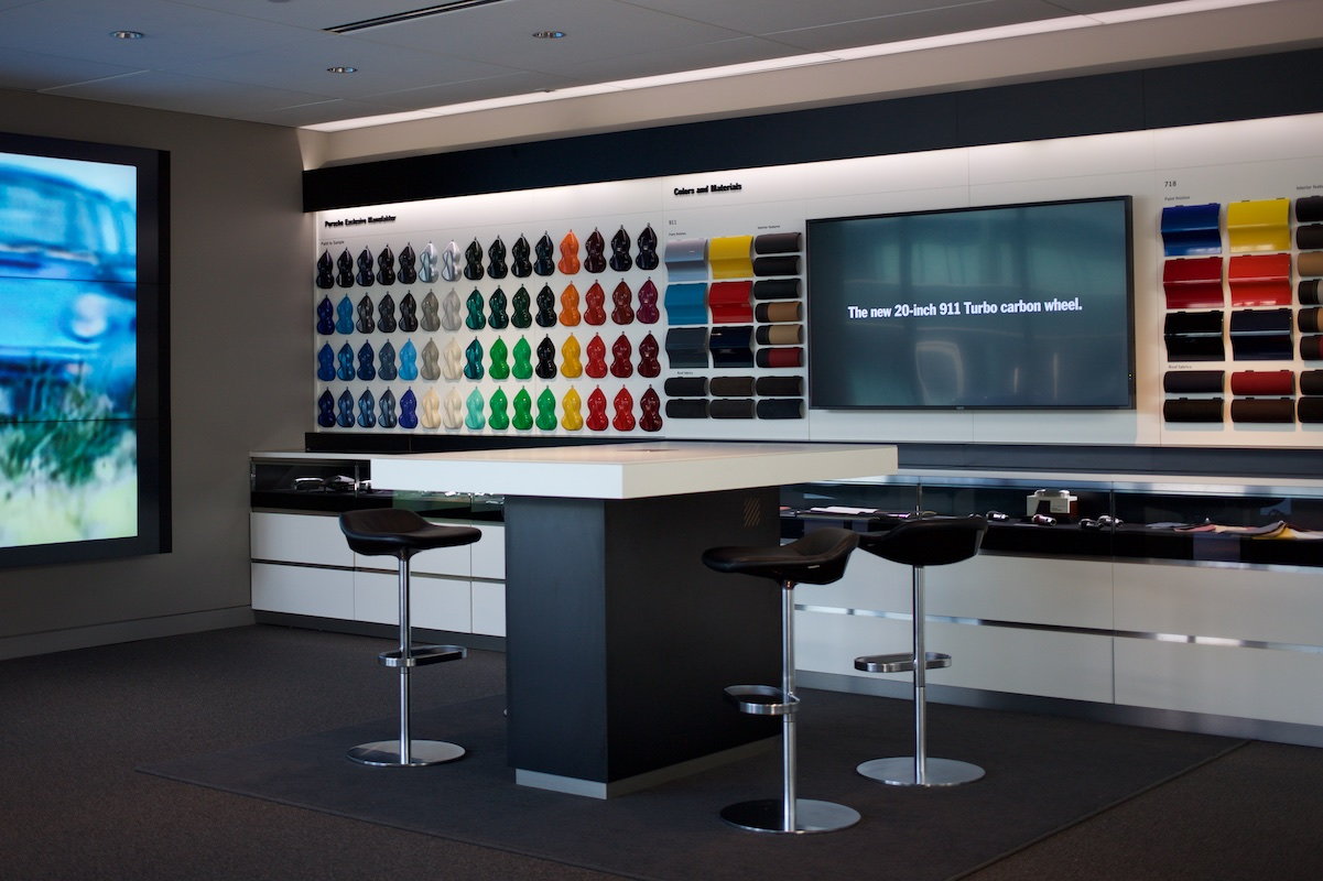
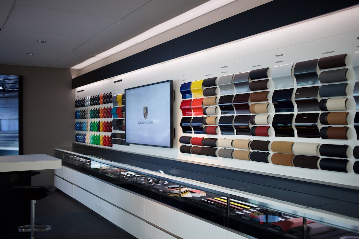
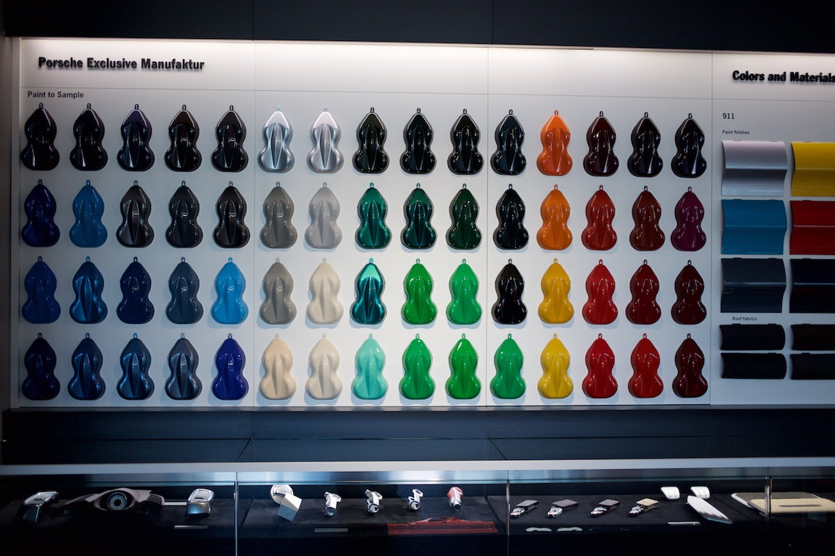
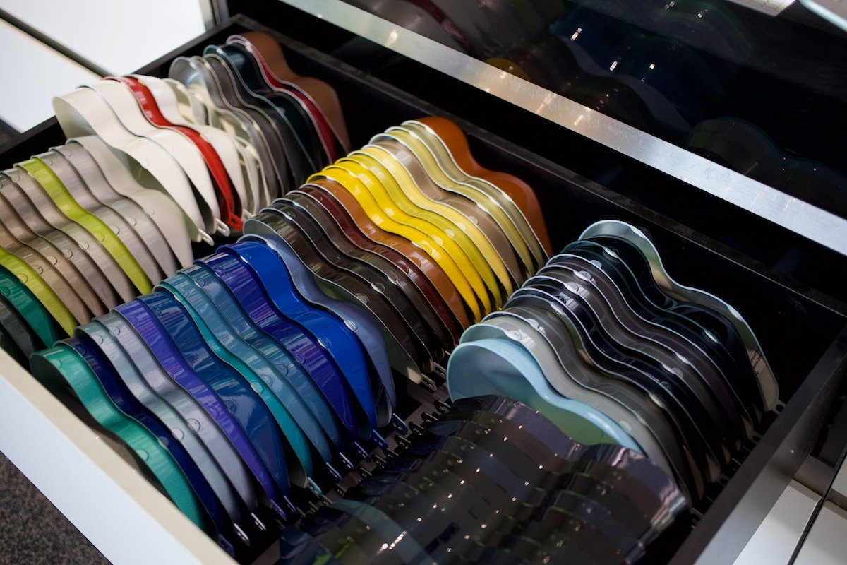
Following are some pics from my visit to PEC Atlanta fitting lounge today where they have an updated mini PTS "wailing wall" (and drawers).
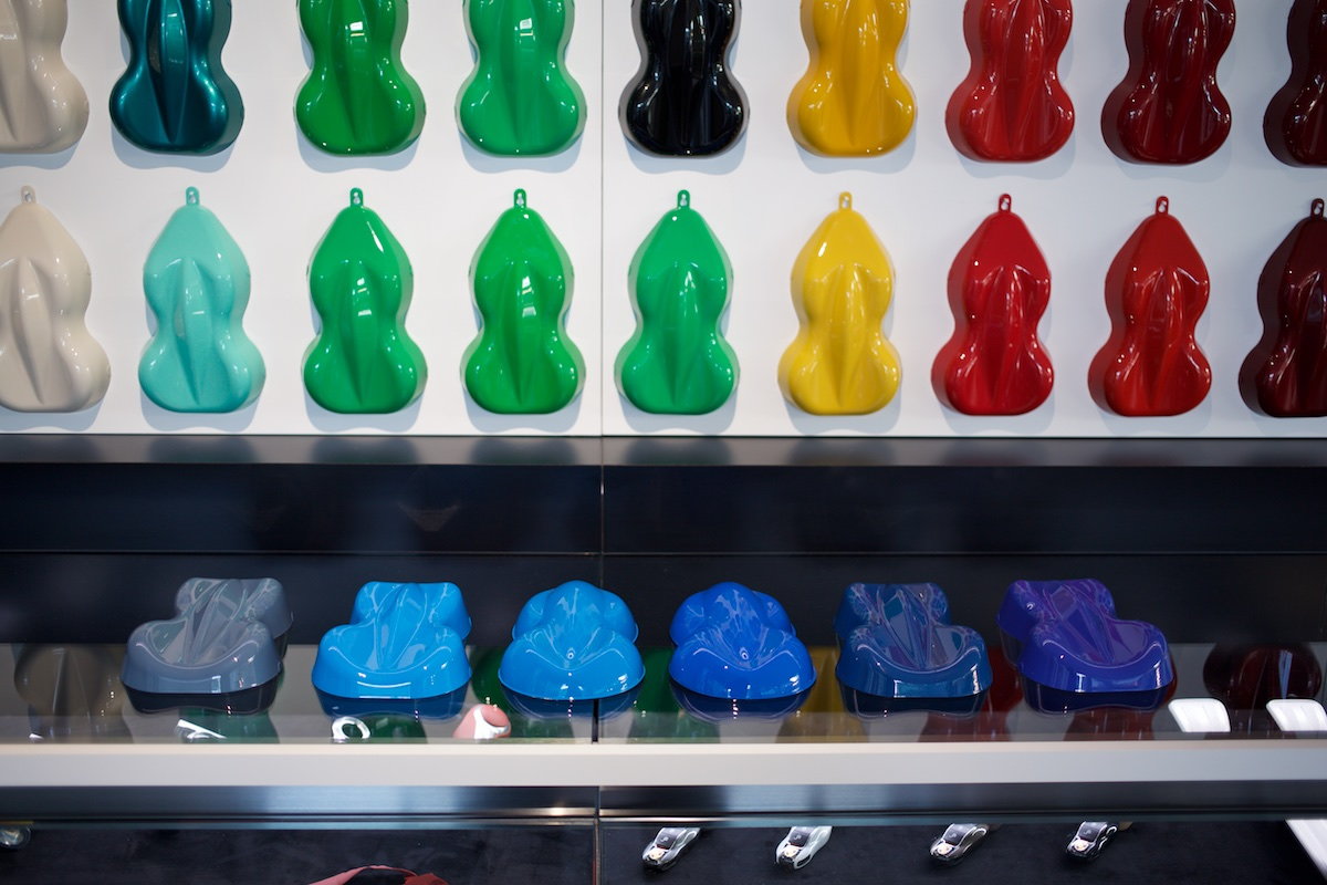
First some general pics. After I'll follow up with some close-ups comparisons I setup of some popular yet similar-to-one-another PTS colors so as to see how they compare to one another in the same pic and lighting.
These were all shot RAW on a Canon 5D Mk. III camera with correct white balance and processed only lightly to ensure proper exposure. So they should be better than if shot on an iPhone, etc...
Lounge is now an open room (they took down the glass walls surrounding it)
The wall isn't very big...
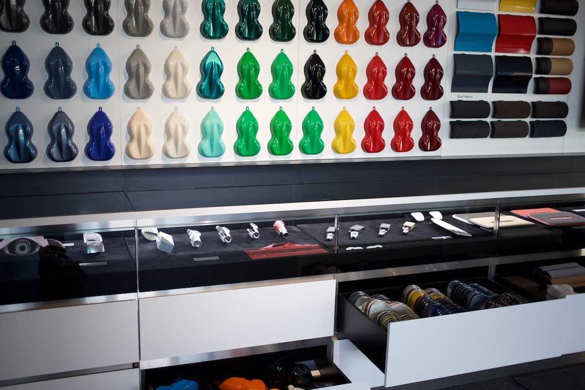
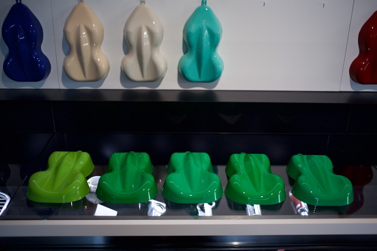
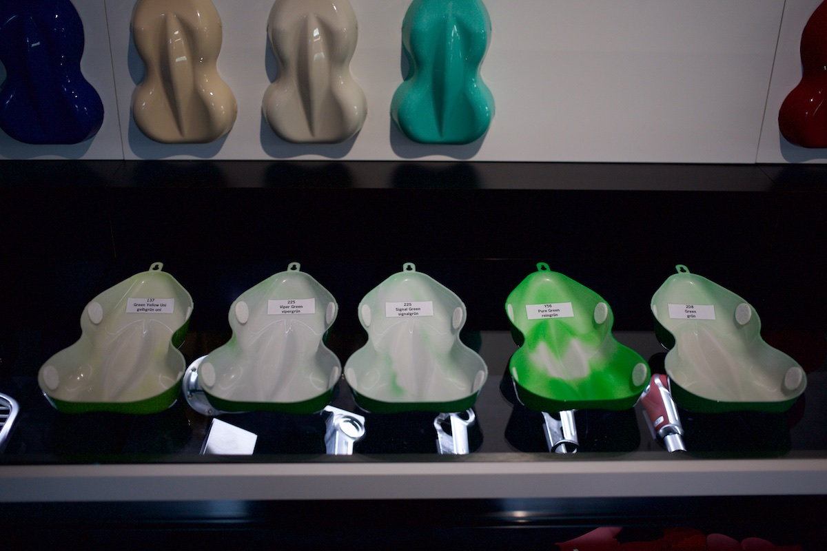
But they have drawers full of more colors below....
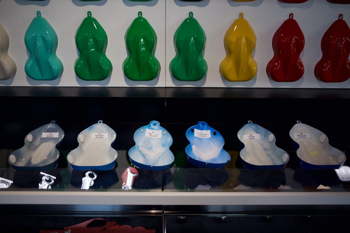
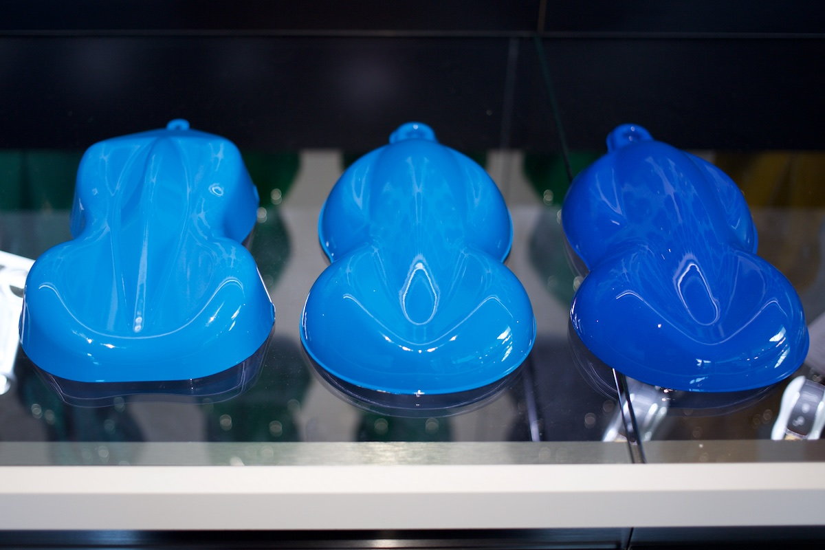
Here is a common comparison people ask for of PTS non-metallic blues...
Here are 6 popular PTS blues people often ask about. I took 2 shots with slightly different exposures to show the differences between them.
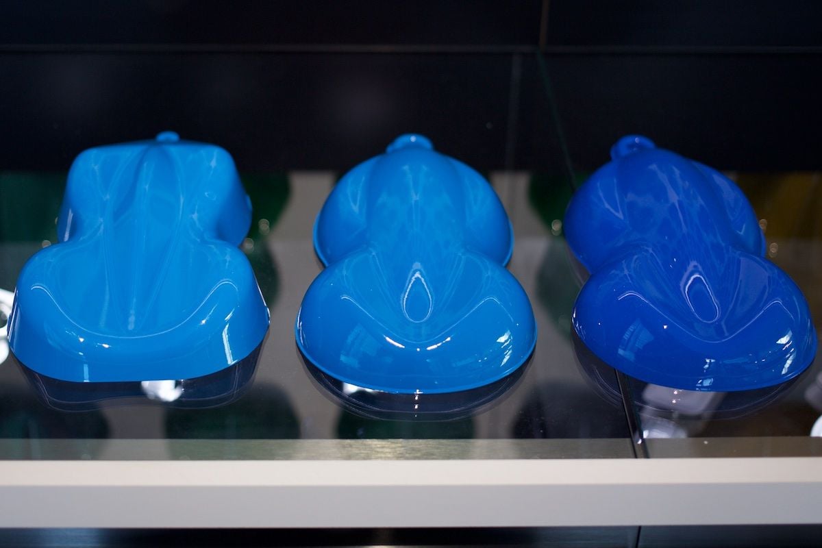
Same 6 blues in same order. Slightly different (darker) exposure, which to my eye in person, looked more like real life. But harder to tell the darker ones apart on this exposure.
From left to right: Etna, Riviera, Mexico, Voodoo, Golf, Maritime.
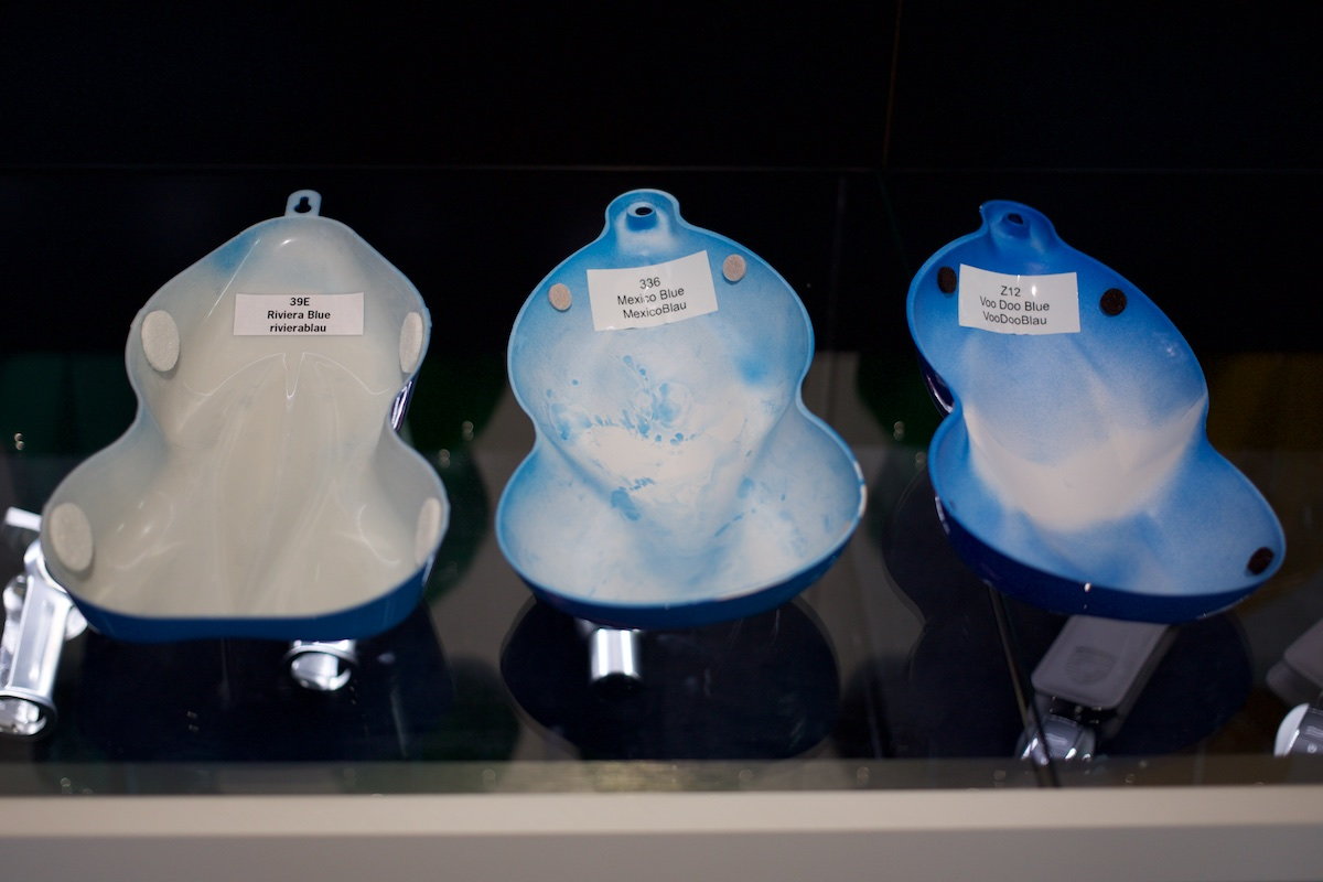
These three are the most asked-about, so did a close up, from left to right: Riviera, Mexico, Voodoo.
Same three in same order, just slightly darker exposure to see differences more easily between Riviera and Mexico.
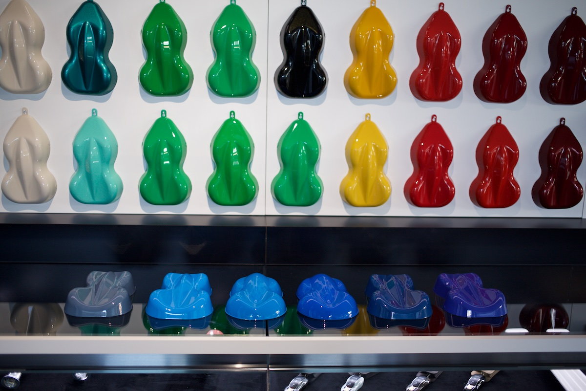
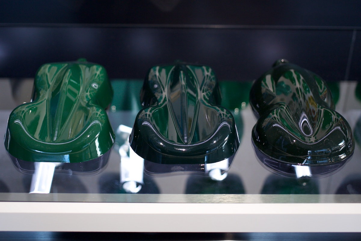
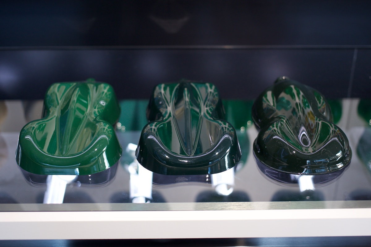
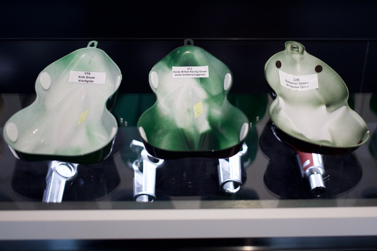
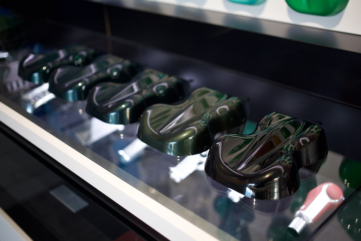
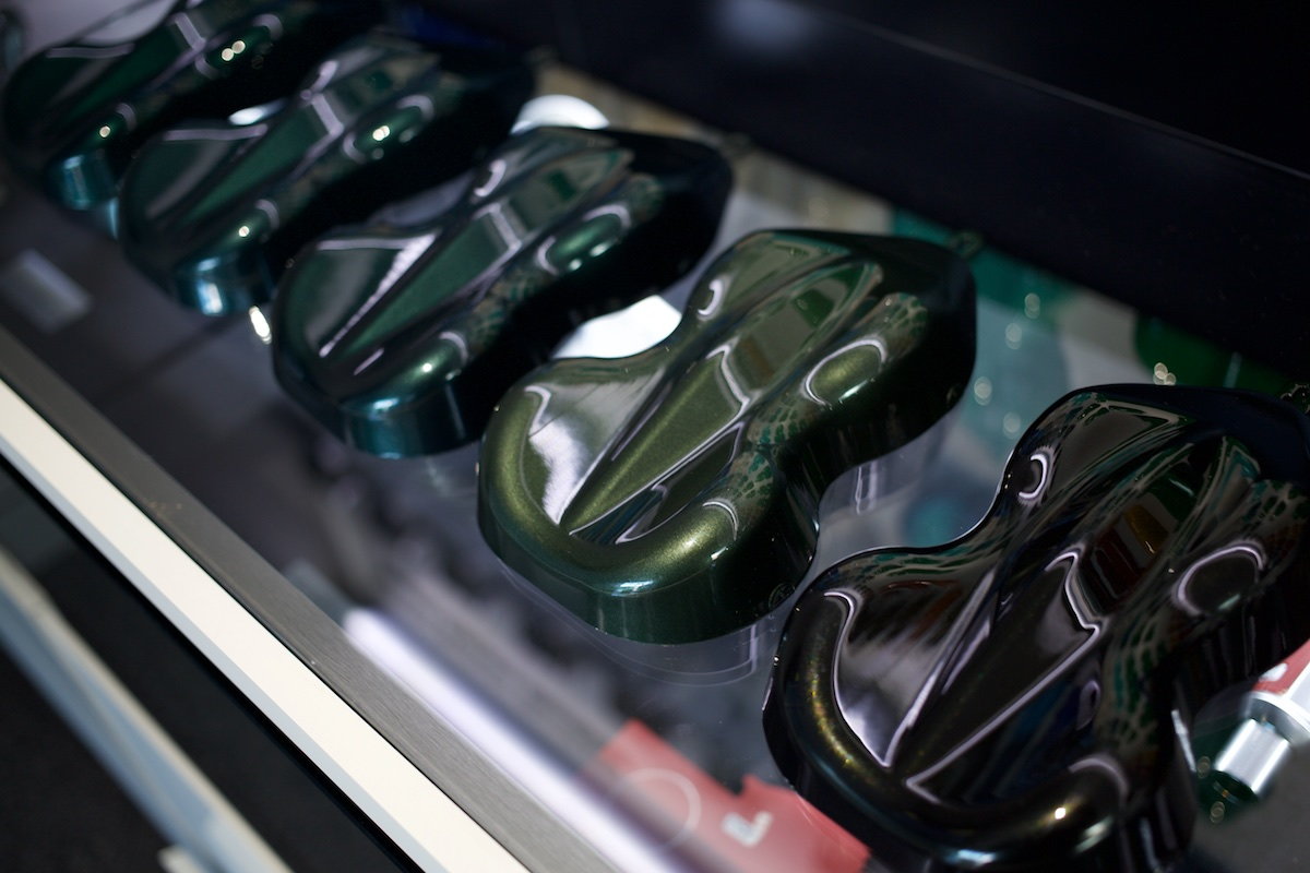
OK, here are the 3 quite popular non-metallic dark green PTS colors compared close-up....
From left to right: Irish, British Racing, and Brewster.
Same 3 samples in slightly different (lighter) exposure to try to show difference better between British Racing Green and Brewster Green. They look pretty close in pic. But in person, Brewster appears more yellow / olive drab (which it takes on much more of especially in sunlight), while British is a little bluer. Personally I find British more pleasing. Irish is of course much lighter than the other two. British definitely my favorite of these three.
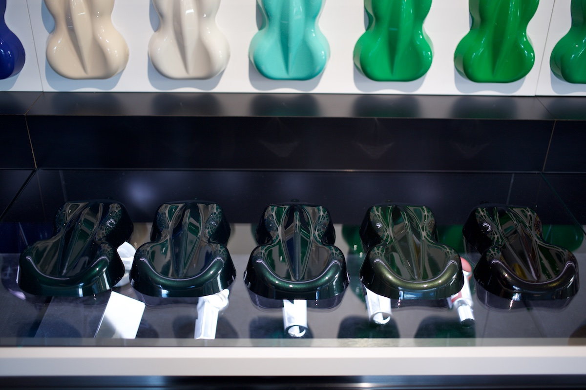
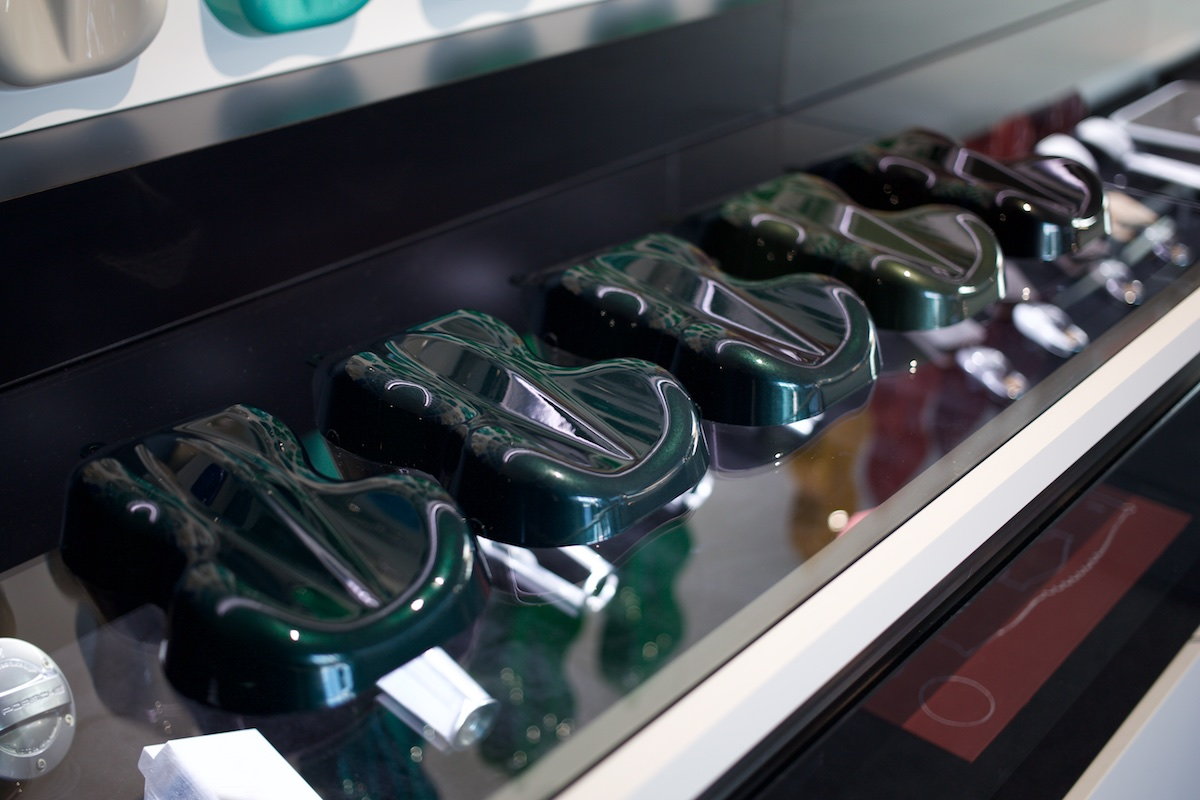
OK, now some of these are much closer to one another, but all the same, they're rarely seen side by side in same light, so here goes...
From left to right: Jet Green Metallic, Porsche Racing Green Metallic, Forest Green Metallic, Oak Green Metallic, Dark Olive Metallic
Porsche Racing Green Metallic (2nd from left) and Forest Green Metallic (middle) are very close to one another. Forest is just slightly warmer (yellower) than Porsche Racing Green.
Dark Olive Metallic (right) and Oak Green Metallic (2nd from right) are both warmer/yellower metallic greens. Olive is just darker.
Oak (2nd from right) is getting a lot of love lately, maybe because Walter Rohrl had his 911R done in this color.
From these shots taken by you for the blues for me would be between Voodoo and Maritime hands down.
The British green for the non metallic darker greens, the Oak metallic for the metallic greens and for the last i think viper.
I know you said British green out of the 3 non metallic darker greens but if you had to select 1 from each row, which would it be and if you had to select one from all the shots you took then, which would it be?
Sorry that I couldn�t shoot more comparison pics while there. I only got to do this while alone in the fitting lounge after my appointment was done and no one was around while killing time before a dinner reservation at 356 restaurant upstairs. It was possible since the fitting lounge is no longer enclosed in glass like it was the last time I visited in April, and the drawers are all unlocked.
But it after about 20 minutes a security guy came up and stopped me saying people weren�t supposed to touch these samples or go through the drawers themselves. oh well.
I had also hoped to do comparisons of all the reds, not metallic and non metallic, since there were many there I�d never seen before (GTS red, Peru red, etc), and the yellows, the greys, and pale blues like Gulf, Meissen, etc. maybe next time.

 09-28-2017 | 11:29 PM