Notices
Macan 2014-Current

Chrome delete

Thread Tools
 
Search this Thread
 
Old 10-08-2023, 09:00 AM
  #1  
PACShrink
Rennlist Member
Thread Starter
 
PACShrink's Avatar
 
Join Date: Oct 2023
Location: SW Florida
Posts: 12
Received 3 Likes on 2 Posts
Cool Chrome delete

I like it this way. Strange, I bought the flat black lettering from Suncoast but, once I pulled the chrome letters off... I decided not to apply them.


Old 10-08-2023, 12:27 PM
  #2  
#1SomeGuy
Burning Brakes
 
#1SomeGuy's Avatar
 
Join Date: Jan 2020
Posts: 1,062
Received 556 Likes on 332 Posts
Default

Eww, moving the S looks so "aftermarket wannabe" cheap.
The following 2 users liked this post by #1SomeGuy:
Docs911TurboS (10-13-2023), steveo17 (10-09-2023)
Old 10-08-2023, 08:16 PM
  #3  
BMinSFL
Pro
 
BMinSFL's Avatar
 
Join Date: Jan 2023
Location: South Florida
Posts: 528
Received 181 Likes on 137 Posts
Default

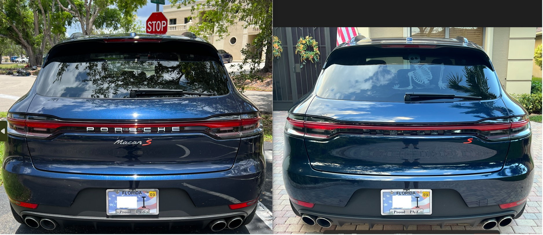
I'm not sure what I'm seeing due to the quality of the image but it looks like recesses and some leftover tape where the letters were.

If it were me, I would add the black letters, remove the red S and then install the clear rear light bar and tail lights because they look so good with the blue.
Old 10-08-2023, 09:35 PM
  #4  
Ironman88
Rennlist Member
 
Ironman88's Avatar
 
Join Date: Nov 2019
Location: Idaho
Posts: 3,249
Received 2,373 Likes on 1,243 Posts
Default

Looks to me like it was vandalized.

Old 10-09-2023, 02:46 PM
  #5  
PACShrink
Rennlist Member
Thread Starter
 
PACShrink's Avatar
 
Join Date: Oct 2023
Location: SW Florida
Posts: 12
Received 3 Likes on 2 Posts
Default

It looked funny in the middle...
Old 10-09-2023, 03:35 PM
  #6  
#1SomeGuy
Burning Brakes
 
#1SomeGuy's Avatar
 
Join Date: Jan 2020
Posts: 1,062
Received 556 Likes on 332 Posts
Default

Originally Posted by PACShrink
It looked funny in the middle...
That's because if you de-badge, you need to fully de-badge...there's no leaving your precious S without the "Macan" beside it.
Old 10-09-2023, 04:57 PM
  #7  
NJR1986
Instructor
 
NJR1986's Avatar
 
Join Date: Apr 2019
Posts: 157
Received 31 Likes on 19 Posts
Default

Not my cup of tea, to put it nicely. I wouldve used the black lettering. Kept PORSCHE but ditched bother the "macan" and "S" Just my opinion, which doesn't matter much since it's your car, do what you like best.
Old 10-09-2023, 05:36 PM
  #8  
Vise
Drifting
 
Vise's Avatar
 
Join Date: Oct 2014
Location: Toronto
Posts: 2,058
Received 332 Likes on 205 Posts
Default

Yeah sorry but for me it looked better before. The red S out of position on the far right is just wrong.

To each their own of course.


Quick Reply: Chrome delete


All times are GMT -3. The time now is 07:38 AM.