

"PORSCHE" deck lid decal-Singer/Magnus
 05-03-2017 | 03:05 PM
#31

Racer
Joined: Jul 2007
Posts: 275
Likes: 0
Yes, "Squish it" a bit more. I also agree that it's too tall. The Letters need to be more compressed so there is minimal space between as Vancleef said.
However I do think the thickness & font is just right. I wouldn't thicken it up anymore. It's pretty close though!
However I do think the thickness & font is just right. I wouldn't thicken it up anymore. It's pretty close though!
05-03-2017 | 03:20 PM
#32
Thread Starter
Rennlist Member
Joined: Apr 2013
Posts: 122
Likes: 0
From: NYC
Width wise, I think it's going to be fairly close, since the trunk itself curves slightly on the sides, the distance between the decal lettering and the side edges of the trunk are constantly changing.
I went back and changed it up slightly based on what you were describing.
I went back and changed it up slightly based on what you were describing.
You have the right idea on the letter compression but the change you made now is a tad too compressed. Look at the Singer car's "R" letter. Your decal needs a hair more space than what you just did & i think it would be spot on.
Just my thoughts of course.
05-03-2017 | 03:49 PM
#33
Racer
Joined: Jul 2007
Posts: 275
Likes: 0
After looking at it more closely, it's slightly more involved than just squishing the letters down. It's actually quite different (if we're looking at the finer details of the decal), than the original Porsche lettering.
Either way, I made adjustments that I think are going to bring it fairly close to the Singer decal. I also did bump up the size/spacing inside the P and R slightly.
Either way, I made adjustments that I think are going to bring it fairly close to the Singer decal. I also did bump up the size/spacing inside the P and R slightly.
Last edited by Don Nguyen; 05-03-2017 at 04:49 PM.
05-03-2017 | 04:48 PM
#35
Racer
Joined: Jul 2007
Posts: 275
Likes: 0
05-03-2017 | 06:42 PM
#36
Thread Starter
Rennlist Member
Joined: Apr 2013
Posts: 122
Likes: 0
From: NYC
After looking at it more closely, it's slightly more involved than just squishing the letters down. It's actually quite different (if we're looking at the finer details of the decal), than the original Porsche lettering.
Either way, I made adjustments that I think are going to bring it fairly close to the Singer decal. I also did bump up the size/spacing inside the P and R slightly.
Either way, I made adjustments that I think are going to bring it fairly close to the Singer decal. I also did bump up the size/spacing inside the P and R slightly.
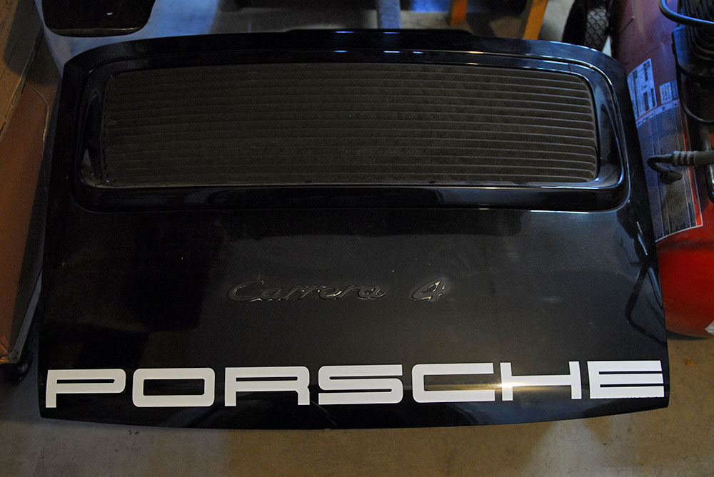
It looks pretty darn close! I still think it needs to be smaller overall. The size looks a little big when you compare your decal to the Singer or Magnus car side by side.
What I would like to know is how do the Singer & Magnus cars get there curve? Yours is placed kind of straight with a slight curve because of the lid surface.
Look at how their decal curves a bit more dramatic:
Would like to get it as close as can be. I'm a bit OCD over this.
05-03-2017 | 08:16 PM
#37
Racer
Joined: Jul 2007
Posts: 275
Likes: 0
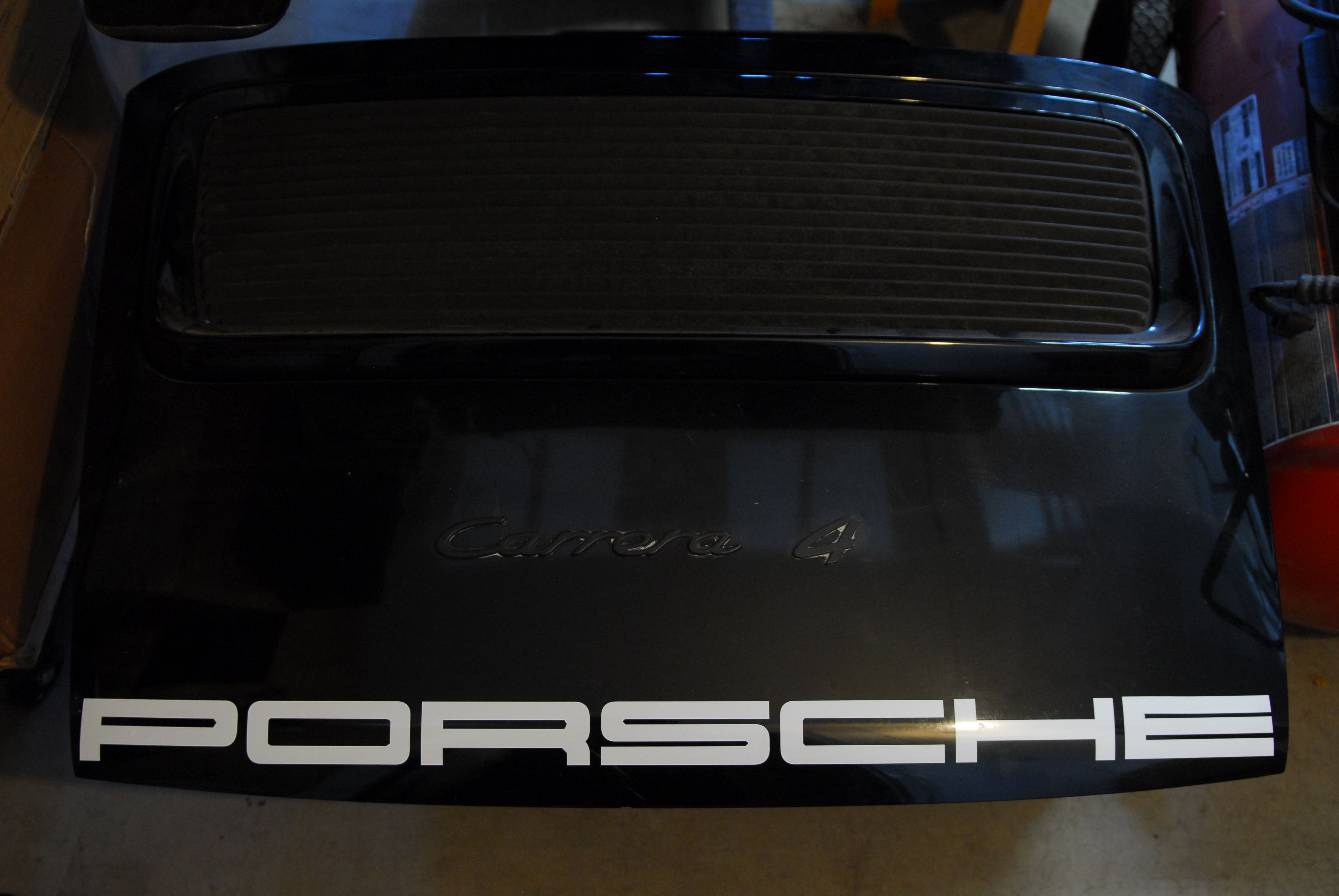
Most likely the curve you're referring to is the angle you're picture is taken from. My picture is right from the top. If you think about it. If you add any curve to the text at all, the spacing on at the top of each letter and buttom of each letter aren't going to be eqaul anymore.
If you compare the actual gap between the bottom of the trunk to the bottom of the decal, you'll see that it's larger in the middle and then tapers on the ends, similar to the singer cars.
If you compare the actual gap between the bottom of the trunk to the bottom of the decal, you'll see that it's larger in the middle and then tapers on the ends, similar to the singer cars.

 05-17-2017 | 09:19 PM
#43
Racer
Joined: Oct 2015
Posts: 449
Likes: 47
From: Oklahoma
I get her back from the mechanic tomorrow so i'll finally be able to install one. I have 3 options: the top 2 were made by the OP. The bottom one is an example of a side stripe from a previous project.
Last edited by OMFS; 05-17-2017 at 09:42 PM. Reason: grammer
05-20-2017 | 09:16 AM
#44
Racer
Joined: Oct 2015
Posts: 449
Likes: 47
From: Oklahoma
So I have to confess that after getting my 964 back the decal is going to be a bit too busy for my taste. I think you may agree:
https://rennlist.com/forums/964-foru...-my-964-a.html
https://rennlist.com/forums/964-foru...-my-964-a.html
05-20-2017 | 09:32 AM
#45

Rennlist Member
Joined: Nov 2013
Posts: 4,069
Likes: 674
From: Austin, TX
So I have to confess that after getting my 964 back the decal is going to be a bit too busy for my taste. I think you may agree:
https://rennlist.com/forums/964-foru...-my-964-a.html
https://rennlist.com/forums/964-foru...-my-964-a.html