

"951" Hat Group Buy....Get in this week.
 08-18-2009 | 03:02 AM
#16

Rennlist Member
Joined: Aug 2005
Posts: 2,673
Likes: 21
From: Los Altos Hills, CA
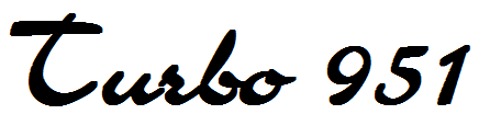
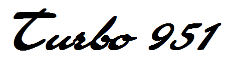
To me the typeface is not quite right. There are script faces that are recognizably Porsche, like here: http://www.jageng.com/garage9/produc...6a6ccdbcc682b2
or here: http://typophile.com/node/5816
or here (see the 986): http://eagleday.com/emandde.html
08-18-2009 | 03:44 AM
#17
Thread Starter
Drifting
Joined: Nov 2006
Posts: 3,212
Likes: 5
From: Colorado
I don't disagree with you on the font and we may try a few other things.
We did a fair amount of research and found that Porsche has used several different type faces for modle designations. The script in most of thise links is a much more modern use than the vintage of these cars. I also don't personnaly like the 944 digital type lettering. If anything the "turbo" type script is closest to accurate for a 951. We just have not found it in a font yet.
Posting from my phone so bear with me here.
_l.jpg)


We did a fair amount of research and found that Porsche has used several different type faces for modle designations. The script in most of thise links is a much more modern use than the vintage of these cars. I also don't personnaly like the 944 digital type lettering. If anything the "turbo" type script is closest to accurate for a 951. We just have not found it in a font yet.
Posting from my phone so bear with me here.
08-18-2009 | 02:07 PM
#18

Nordschleife Master
Joined: Mar 2006
Posts: 8,695
Likes: 134
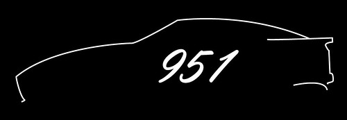
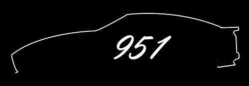
I always liked the silhouette of the fat fenders.
What about using something like this? (Sorry it's messy, I drew it up quick with a sharpie and the help of a photocopier to lighten the image behind it.) Maybe put the "951" between the headlights, or below?

What about using something like this? (Sorry it's messy, I drew it up quick with a sharpie and the help of a photocopier to lighten the image behind it.) Maybe put the "951" between the headlights, or below?

 08-18-2009 | 06:43 PM
#22
Thread Starter
Drifting
Joined: Nov 2006
Posts: 3,212
Likes: 5
From: Colorado
I kinda agree on the wing. We tried it both ways.
I really wanted the lower rear spoiler in there since it is so specific to the 951 over a standard 944. Just a thought.
We will probably work on it agian tonight to see if we can't get the numbers a little more "Porsche"
I really wanted the lower rear spoiler in there since it is so specific to the 951 over a standard 944. Just a thought.
We will probably work on it agian tonight to see if we can't get the numbers a little more "Porsche"
08-18-2009 | 07:06 PM
#23
Nordschleife Master
Joined: Dec 2007
Posts: 7,759
Likes: 1
From: Fly Away
 08-18-2009 | 07:09 PM
#24
Thread Starter
Drifting
Joined: Nov 2006
Posts: 3,212
Likes: 5
From: Colorado
I don't really like the block type Porsche letters, like the more script like.
The 9 and the 1 are pretty easy to get Porsche like. The 5 is the issue really since there is nothing to compare it against.
The 9 and the 1 are pretty easy to get Porsche like. The 5 is the issue really since there is nothing to compare it against.
08-18-2009 | 07:27 PM
#25
Nordschleife Master
Joined: Dec 2007
Posts: 7,759
Likes: 1
From: Fly Away

 08-19-2009 | 09:39 AM
#29
Rennlist Member
Joined: Oct 2004
Posts: 4,193
Likes: 1,697
From: NY NY
hey the design with the side shot and scripted 951 is great!!!!
i would take 3
DO NOT CHANGE IT
add a combo of colors for the stiloette
and the front cap brim should have the German racing colors small but noticed
i would take 3
DO NOT CHANGE IT
add a combo of colors for the stiloette
and the front cap brim should have the German racing colors small but noticed
08-19-2009 | 10:05 AM
#30

Addict
Rennlist Member
Rennlist Member
Joined: May 2001
Posts: 982
Likes: 13
From: Decatur, Al