When you click on links to various merchants on this site and make a purchase, this can result in this site earning a commission. Affiliate programs and affiliations include, but are not limited to, the eBay Partner Network.
I chose to go "vintage" with an OEM 911E badge. I cut off the E and the mounting pins and attached it with 3M badge tape. Put it on about 5 years ago. It is a little small for the car, but I like the classic Porsche font. Classic 911 badge on 2010 C2.
I like adding black elements to the Meteor Grey body color, but went with a red plastidip color change for the original badging. I'm considering redoing it in black for a year to see how that goes...
I agree that black would look better especially with the darker tail lights. Otherwise the red of the lights would marry it.
Pete - pretty sure we're talking about the same guy. Jim @ carreraeast I like the ones you have had made.
You think the "all blue" is too much ?
Yes, your probably right as his name is Jim.
I think the all blue won't look as good as the two-tone. I've seen all black cerakote on a black car and didn't like it as much. The second color should match the wheels or inside headlight color or similar to tie it all together.
This is what I did on the Cayenne where the silver body accents go with the headlight insides and why I chose silver wheels.
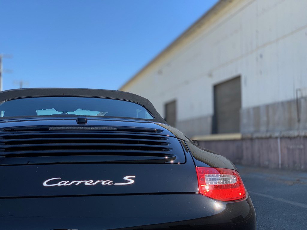
I prefer the original silver color on a dark car and black on a light colored car. I don't really like the mixed silver with red "S" so much. I thought about doing it because I have black and the red actually looks pretty good on the black but I kind of like the original silver. I like some of the originality here when it comes to changing the actual wording etc. but again, I'm just liking the purist look.
Plasti dipped Carrera black and S red
I modified my emblem with black and red plasti dip. Th black Carrera goes well with the black paint, better than the brushed metal look of the original emblem and I like the pop of the red S.
the problem with the aesthetic on this one is that it isnt executed correctly
- the P O R S C H E letters are measured from the top of the decklid here - if you look at the car from the back the word will be slanting downwards (frowning)
- Carrera is a tad too high
- the S was put on as an after thought, without repositioning the Carrera to the left
- the red S is 997 sized, its around 30% larger then the 991 sized badging and is out of alignment
alot of creative ideas can work, they just need to be executed properly via an oem, cleaner, lined-up approach imho.
Originally Posted by boxtaboy
When I was first looking for my 997S, I saw this pic below of a car nearby me that was for sale. One look at that, and I was like, NO! It�s trying too hard to look like the newer model...either that or a ricer with Christmas lights.
I think black Carrera S lettering would go better with your blackout look. The bumperettes...are they a darker shade of grey than the rest of the car? They stand out.
the problem with the aesthetic on this one is that it isnt executed correctly
- the P O R S C H E letters are measured from the top of the decklid here - if you look at the car from the back the word will be slanting downwards (frowning)
- Carrera is a tad too high
- the S was put on as an after thought, without repositioning the Carrera to the left
- the red S is 997 sized, its around 30% larger then the 991 sized badging and is out of alignment
alot of creative ideas can work, they just need to be executed properly via an oem, cleaner, lined-up approach imho.
You�re right that the placing is wrong on that example, but I still think that 2 rows of writing on the back lid of the 997 is kinda too busy looking. JMHO.
Pete - pretty sure we're talking about the same guy. Jim @ carreraeast I like the ones you have had made.
You think the "all blue" is too much ?
Forgive me for a totally silly concern about your crest quest. But I would note that the crest is a combination of two coats-of-arms, and that color is quite important in heraldry. If you go changing the colors on the crest, it just fundamentally isn't the W�rttemberg-Hohenzollern + Stuttgart design anymore.
As I said, that's a bit ridiculous, so feel free to do whatever you think looks good.
Meanwhile, my 997.2 has the stock "Carrera 4S" badging, and I intend to keep it. It's not about looks, really, but identification. If someone sees a 911 and doesn't immediately know it's a 911, that person also doesn't care. So the straight 911 badge doesn't do anything functional. Same story with the P O R S C H E lettering. By contrast, I regularly see a 911 and wonder which sub-model it is; the badging quickly explains it to me and I can be all like "oh, a 4 GTS...nifty" or whatever.
That said, lots of the examples above look great. Do what you feel...
+1. I like the stock badging on the c4s . Not too much- not too little. All in one line, and seems to balance well....
Forgive me for a totally silly concern about your crest quest. But I would note that the crest is a combination of two coats-of-arms, and that color is quite important in heraldry. If you go changing the colors on the crest, it just fundamentally isn't the W�rttemberg-Hohenzollern + Stuttgart design anymore.
As I said, that's a bit ridiculous, so feel free to do whatever you think looks good.
I get it, but a gold crest with red does not go with my silver car at all. I've got one from Carrera East on both my 996 and 997- all black. I;m thinking about the nickel plate and black/silver though.
+1. I like the stock badging on the c4s . Not too much- not too little. All in one line, and seems to balance well....
I�m with StriperSteve .... I like the overall dimensions and placement of the model designation on our 997�s, although I did add just a LITTLE bling to the stock badging on my 4S Cab

 07-12-2019, 05:04 PM