When you click on links to various merchants on this site and make a purchase, this can result in this site earning a commission. Affiliate programs and affiliations include, but are not limited to, the eBay Partner Network.
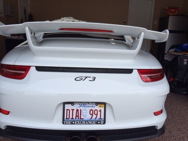
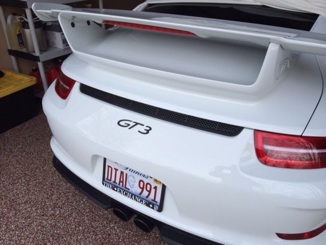
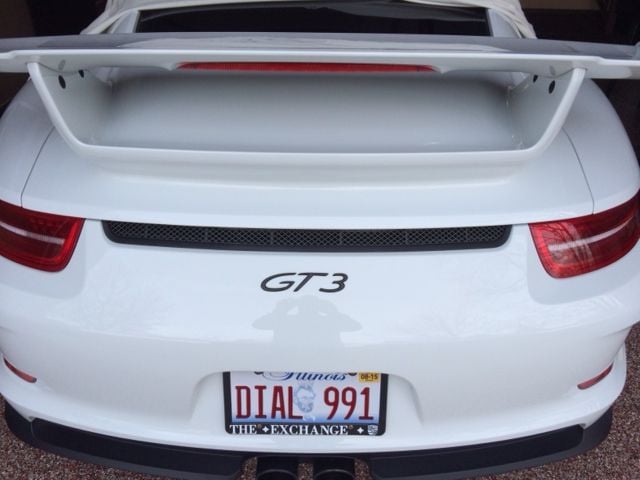
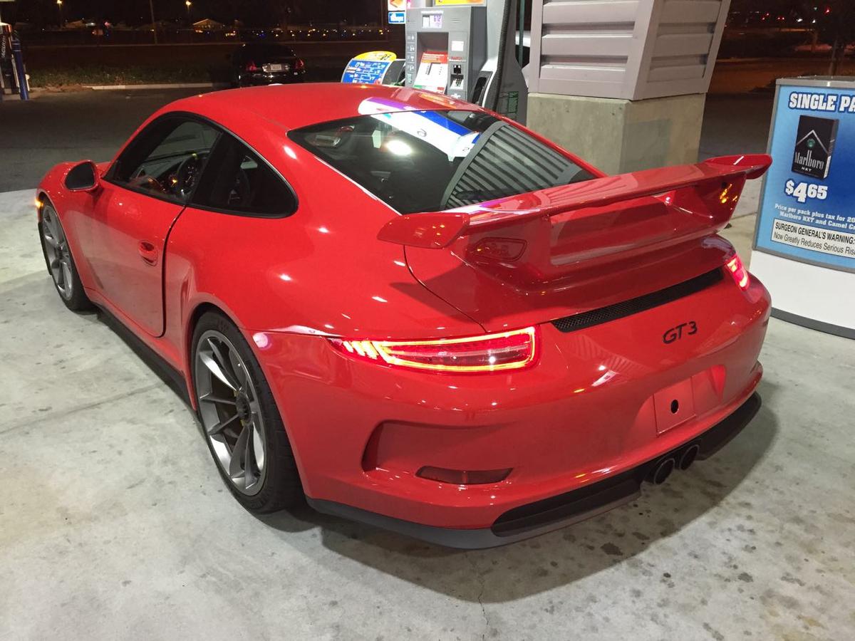
I had the PORSCHE lettering removed from my GT3. To me, it not only takes up way too much space, but is blatantly redundant. Everyone knows it's a Porsche.
There s a few of us on here who have done it and all really happy. Its the larger 997 GT3 badge and it isnt cheap. Heres a few from different angles...IMO its WAY too busy with the Porsche lettering which is a retro touch I really don't like on the new Porsches...
As you can see in addition to being larger, it's up further and centered than the current "GT3" now that PORSCHE is gone.
You can't just take the current "PORSCHE" off and leave the "GT3" where it is.
I really like Macca's with the bigger 997 GT3 script sans Porsche lettering. That's how I'd do it personally. I might drop it just a hair lower because in some of those pics of his car, it looks like it might be just a tad too high and not quite centered, like maybe down a 1/4". But that also could just be camera angle. I agree with everyone, the Porsche lettering is both redundant and too busy. But that expanse of property is too big to have nothing and the 991 GT3 lettering is definitely too small to fill it properly. Though it doesn't look terrible, Easy888's looks fine, but it does look bit too small for my tastes. I think consensus agrees, 997 GT3 ala carte for the rear.
Had the dealer remove the "P O R S C H E" at delivery in January, 2014. PAG would NOT agree to doing it ... haha.
Echoing other posts, the "P O R S C H E" is makes the rear too busy and detracts attention from the "GT3" on back ... hope the "GT3RS" hangs out alone on the back ... will see tomorrow (or Tuesday) at the Geneva launch.
I also removed the stock rear badging and had the 997.2 "GT3" placed on the rear. Looks great and the perfect size. The stock "GT3" too small. Would not hesitate doing this. The full stock rear badging way too busy. Tried posting but for some reason all upside down - see below:
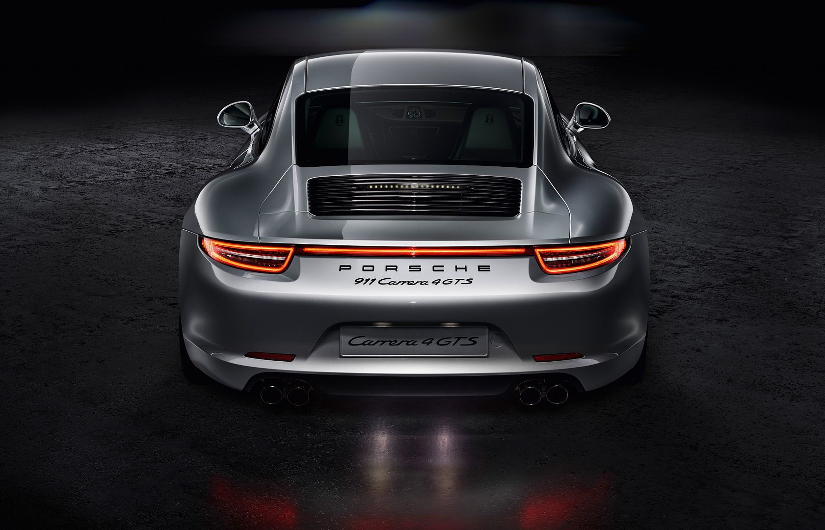
I agree with those who have removed the excessive Porsche badging from the rear of the car ,,,,it just looks like to much with it there IMO ,,,and a simple GT3 badge just looks more classy and clearly details what variant of 911 it is...........I am certain this has been mentioned before ,,but just have a look at the badging on a carrera 4 GTS ,,,it is way to much for my taste a simple 4 GTS would be more than enough .....
I also removed the stock rear badging and had the 997.2 "GT3" placed on the rear. Looks great and the perfect size. The stock "GT3" too small. Would not hesitate doing this. The full stock rear badging way too busy. Tried posting but for some reason all upside down - see below:
This is the best placement of the badge I've seen. It's perfect. You should measure the height off the top for the guys.
 03-01-2015, 07:52 PM


 ,,,,it just looks like to much with it there IMO ,,,and a simple GT3 badge just looks more classy and clearly details what variant of 911 it is...........I am certain this has been mentioned before ,,but just have a look at the badging on a carrera 4 GTS ,,,it is way to much for my taste a simple 4 GTS would be more than enough .....